 Multi-cultural Brussels is often described as a laboratory for Europe. On April 17-18 technical writers from throughout Europe took their turn sharing experiments and ideas at the annual TCeurope Colloquium.
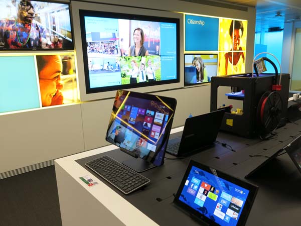
Hosted by STC France, the venue for the event was the state-of-the-art Microsoft Executive Briefing Center in the heart of Brussels’ European Quarter. Participants engaged in a full-day of five in-depth sessions that focused on the theme of “Riding the Waves of Change.”
The Future of Information
Laurie Pattison
Senior Director of Applications User Experience, Oracle
Laurie took the audience on an evolutionary ride from a family huddled around a handcrafted oak case radio (receiving content at set times by set people) to a person receiving a gentle tap from their Apple Watch when it’s about to rain (receiving content when one wants on demand).
The direction and pace of this evolution has always been dictated by users themselves. The users emerging today (Generation Z) are tech innate, share judiciously, enjoy making stuff (especially collaboratively), communicate with images, think in 4D, and have 8-second attention spans.
Ever-diminishing attention spans mean that simplicity rules supreme in content delivery. This simplicity is required literally at the user’s fingertips, as mobile is now a part of everyday life. Since users generally glance at and scan mobile content, it must be visual and brief, emphasizing what really matters. The content should also be tailored to fit the device, be it a tablet, phone, or watch.
Despite shorter attention spans, we all crave engagement. And that forces companies towards providing content experiences that are rich, immersive, and interactive, best delivered using storytelling – which Laurie defined as “creating order out of chaos.”
Boosting engagement even further is the Internet of Things – the growing network of everyday objects that can share information and complete tasks for the user. As information sharing and interaction explodes, content truth and credibility are becoming increasingly important.
Producing Support Content for Responsive Websites
Laura Katajisto
Solutions Manager, Microsoft Mobile,Tampere, Finland
Laura demonstrated that technical communicators already have the skills required to produce content for responsive websites (minimalistic writing, modular documentation), but argued they may need to learn more about designing websites and adapting content for multiple different “breakpoints”.
She described how Nokia, recognizing a drop in desktop usage for accessing support content, took a “mobile first” approach and migrated over of 26,000 support pages to responsive web, adapting them to all screen and device sizes.
Mobile device performance, display space, connection speeds, use on the move, memory space, and even screen glare all have an effect on the content reading experience. More than ever, writers are forced to be concise and to the point, because mobiles devices rarely accommodate wordiness or big images to get a point across.
Laura offered seven best practices for responsive web design:
- Plan first
- Start from mobile
- Keep things simple, allow the user focus on the most important actions
- Test with real content (lorum impsum doesn’t cut it).
- Use available technologies for, e.g. graphics scaling – don’t reinvent the wheel.
- Allow site elements and content to compress
- Leave time for “minificiation”.
Mobile first should be integrated into every company’s strategy, rather than existing a separate strategy or work effort.
TCeurope 2015 was held at the Microsoft Executive Briefing Center, Brussels, Belgium,
Creating User-centric Environments for Product Assistance
Ferry G. Vermeulen
Director, Manualise,Amsterdam, Netherlands
Not satisfied with the static outputs offered by help authoring tools, and recognizing that navigation, intuitive design and look & feel are far more developed in the field of Web design than the field of tech comm, Ferry got an idea. By combining the HTML output of a single source software with a CMS for websites, he created a much more intuitive and user-centric environment that combined several useful user assistance tools, like full-text search, browsing , PDF downloads, FAQs, video tutorials, trouble shooting, twitter and chat widgets and building online communities.
While presenting his case study, Ferry shared the process he follows when developing custom Web outputs for his clients:
- Analyse your user and his information need: create a content model (list of the topics your user needs).
- Determine how you want to present the information (front end).
- Build your (e.g. MadCap Flare) project to match the front end.
- Ask a developer to build and connect a web-CMS with your content.
What You’re Missing About Mobile
Rachel Johnston
Consultant, Mekon, Manchester, UK
Rachel explored the challenges and opportunities of small screens, big content and the surprising realities of our new, multi-screen world by busting several myths about mobile content:
- Myth 1: “It’s not for us” (irrelevant, “our content is too serious for this)
- Myth 2: It’s too hard (all the screen resolutions, platforms, languages)
- Myth 3: Mobile users are busy and distracted
- Myth 4: A responsive design is enough
- Myth 5: Search box is enough (search is difficult, users aren’t skilled enough to use it; browse is crucial)
- Myth 6: Mobile is less (too often seen as a companion experience)
Creating Videos for a Software Product—A Steep Learning Curve!
Martin Block
Senior Technical Author, Remsdaq Ltd, Flintshire, UK
Martin’s session took the audience through his experiences of creating a suite of short narrated videos to supplement a set of HTML Help pages required for a new-look item of software. The troubles he experienced with mouse work, synching the animations and soundtracks, and the time, effort, and resources involved resonated with the audience. It was therefore no surprise that Martin was asked the most questions by the audience.
The video production process Martin developed is as follows:
- Assemble list of topics requiring videos
- Write scripts for videos
- Record soundtracks
- Cut up scripts into snippets
- Prepare for video shoots
- Create animation-only videos
- Bring script snippets and animations into editing package.
- Add in title sequences.
- Match script snippets to animations.
- Save compiled MP4s.
Documenting Lean with Task-oriented Help that Runs on Top of Web Applications
Kristof Van Tomme
CEO, Co-Founder, Project Lead, Walkhub, Pronovix, Sleidinge, Belgium
Kristof presented an alternative to traditional software videos. WalkHub, his step-by-step interactive tutorial and documentation system, combines the best practices from the technical writer community, DITA, and online UX design. It is used to create Walkthroughs, which are tutorials that guide users through an interface, one step at a time.
Just like a GPS in a car enables you to reach your destination without first having to learn the road you want to take, Walkthroughs give people just enough information at just the right time so that they can successfully complete tasks faster with much less effort.