![]() TechWhirl’s coverage of WritersUA 2012 is sponsored by Madcap Software. Find out more and download a trial copy of Flare 8.
TechWhirl’s coverage of WritersUA 2012 is sponsored by Madcap Software. Find out more and download a trial copy of Flare 8.
 Presenter: Mike Hamilton, Madcap Software
Mike Hamilton, VP of product management for MadCap Software and member of the Orange County Chapter of the STC, really got specific at his WritersUA session on CSS3, compared to Scott DeLoach’s broader overview of CSS3. Hamilton believes most technical communications teams do not CSS2 to its fullest potential. So he focused on providing practical and applicable tips for CSS2 and CSS3 as it makes its way to adoption as a standard. Although Hamilton described CSS techniques using Flare, his tips are applicable regardless of the program used. He reminded participants that the DIV element “is our friend;” that the key to layouts is using the attributes Float, Position and Overflow; and that while CSS3 holds promise, the promise comes with caveats.
CSS Tip One: List Styles
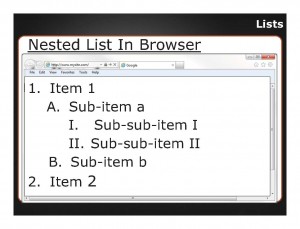
He first described methods for handling lists in CSS, something the Adobe® representatives also spoke to during their tool seminar. There are two types of lists—ordered lists (OL) for numbers or letters and unordered lists (UL) for bullets. To build nested lists, you will have to create multiple styles in your CSS by manually applying those styles each time. However, you can use the contextual selector or “complex” to auto apply the style, which dictates how a sublist will be handled based on position. When setting it up, use spaces to designate your indent because applying styles like this defines the position or nesting level of a list. For example, to format a second-level list with uppercased alpha and a third-level list with uppercase roman numerals, you would write the CSS as follows:
ol ol
{list-style-type:upper-alpha;}
ol ol ol
{list-style-type:upper-roman;}
Then, every time you indent a list, the CSS will auto apply the style you established. This is especially useful in instances where your corporate style may change, since you can adjust the style in the CSS to update all instances in your user assistance (UA).
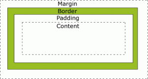 Hamilton asked attendees to think in terms of the CSS2 Box Model when establishing list styles, understanding there are borders, margins and padding attributes with any layout.
Padding refers to the space between the content–the unseen box inside of which the text lives, which are surrounded by a border, all of which dwell inside a set margin. Lists are more complex because you end up with a big content box for each list. Each list item is in a box and all boxes of a list are in a box, each with its own padding margin, and borders. To make working with LI and OL or UL items easier to see, make the border visible during set-up. Just remember to turn the borders off again before production. The border attribute in the CSS controls the appearance of the border.
 CSS Tip Two: DIV Elements
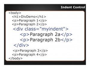
Next, Hamilton covered the importance of the DIV element and its use in indents. Remember, markup languages such as HTML do not use the “tab” for indenting in the way word processing does, so you must use styles to create lists and set indents. Hamilton cautions against creating an abundance of list styles. By keeping indents consistent from one level to another (e.g. 10 points), you can set the indent in one style. Use the DIV element for CSS control, because unlike Word, styles are applied to tags not text. In CSS, DIV serves as another container element to hang styles on without changing the original piece.
Instead of applying various paragraph styles that are slightly different, create a DIV element in your CSS with just one style and wrap styled paragraphs within the DIV to apply that style on top of the paragraph style and multiple levels of a list style. For example, you can add:
div.myindent
{
margin-left: 18pt;
}
Then you wrap any piece of content that needs indented with the DIV, including as many paragraphs or list items as needed.
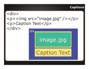 Tip Three: Captions
Hamilton described the problems that many technical communicators have with formatting captions and keeping the caption with the image as the image is moved around. Once again the key is to use a DIV that wraps both the caption and the image so that the two move as one unit, “…don’t try to fight two things…make them one thing and they will always move as a group, they will always stick together.”
CSS Tip Four: Keep with Next
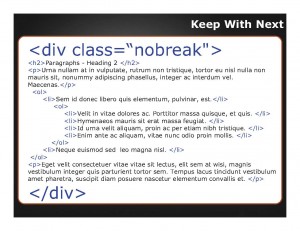 Hamilton next moved the best way of dealing with a common complaint in blogs—the lack of Keep with Next in CSS—the DIV. To do the same thing as Keep with Next, wrap the content you want to keep together on the same page with the DIV, and use the attribute page-break-inside: avoid; which forces the DIV with the class no break (div.nobreak) that you can assign to multiple components (paragraphs, lists, etc.). This ensures that those items stay together without a page break in the wrapped content if possible. This also allows you to reduce the number styles because you apply the one DIV anywhere rather than creating another version of each style you want to keep together. He cautions against wrapping too much content to fit on a page. Instead wrap closer to a third of a page of content to gain the functionality of keep with next. This styling works even when content published to the web and a user wants to print it. You can also use a similar DIV with other tags, for example, to assign a page break before a chunk of content.
CSS Tip Five: Positioned Content
Hamilton spoke to the problems with positioned content such as cases where you want a chunk of content aligned right, but also want content to fill the gap to the left of it. He used a navigation box as an example. In this case, the DIV can allow for text wrapping using a float attribute. Enter div.floatright in the style sheet to force remaining text to wrap around the content within the DIV. If you add padding, margins and a border to the div attributes, anything enclosed appears within a box. This works on any content, including graphics. You can also set a fixed width on such boxes within the DIV, but you have to watch the content to ensure it won’t overflow the size you’ve given it.
Hamilton also gave tips related to positioned content on non-scrolling region using a CSS. To do so, you will actually style three items:
- First, apply overflow: hidden to the body to turn off scroll bar;
- Next, on Heading 1, set position: fixed to keep it from scrolling. You must designate where you want that content to appear in the attributes such as top: 0 pixels to set it to appear at the top of the page.
- Finally, create a DIV to designate a new scroll area position:fixed; overflow: auto and set margin to where you want the scrolling area to start.
In your style sheet having these three things allow designating a scroll area:
| body{overflow: hidden;width: 100%;height: 100%;} | h1{position: fixed;background-color: #c0c0c0;border-bottom: solid 2px #000000;margin: 0px;padding: 10px;left: 0px;
right: 0px; top: 0px; width: 100%;} |
div.scrollarea{position: fixed;overflow: auto;margin-right: 2px;height: 85%;margin-top: 48px;} |
The Promise of CSS3: Rounded Borders, Word Wrapping and Font Specification
CSS3 is not an official specification yet, though many browsers are already supporting specific aspects, including border controls, text handling and fonts.
CSS3 allows for curved borders. Simply use border-radius: 50px to get rounded/curved corners, and apply to graphics and/or DIV. The border-radius attribute works in every browser except FireFox, where you must add the moz prefix, -moz-border-radius: 50px. The good news—you can put both styles to cover more browsers in your CSS and it will render the styles the same, and it fails gracefully to square borders in browsers that don’t support it.
Syntax
-moz-border-radius: 50px;
border-radius: 50px;
For text handling, CSS3 eases word wrap and text overflow. Use word wrap to wrap a long word without cutting off a word that doesn’t fit within a content box. Caveat: you can’t use it and hyphens.
Syntax
word-wrap: break-word;
Normally, clipped is the default for content, but text overflow applies ellipses to text that overflows instead of just clipping text at border.
Syntax
Text-overflow: ellipsis;
Before CSS3, you could, at best, guide substitutions for various fonts in styles. With the CSS3 @font-face attribute, you can upload fonts to your server and have users download the fonts necessary to render pages. There are several caveats with this feature, including browser support of font types (e.g., Internet Explorer only supports embedded opentext fonts .eot; Firefox, Chrome, Safari support :ttf and .otf but not .eot), you must have permission/legal rights in paid-for fonts to distribute/share with the public, and your fonts must be available from your web server. You should supply the font family in eot and ttf to cover either browser instance:
Syntax
@font-face
{font-family: myCoolFont;
src: url(‘myCoolFont.ttf'),
url(‘myCoolFont.eot'); }
You may find font families more readily available from one of several new font foundries, such as www.fontspring.com, that can provide the family and the licenses to share. You can get different rates too for one particular font versus all its versions, bold italics, etc. Hamilton pointed out the @font-face attribute can be helpful to ensure that, at the least, your company logo displays as expected.