Wireframing, Mockups, and Prototyping Made Easy
 Speaker: John Collins, Senior Technical Writer, Atlassian
Slideshare: http://www.slideshare.net/JohnCollins22/wireframing-mockups-and-prototyping-made-easy
Many technical writers increasingly find themselves taking on hybrid roles. Or perhaps technical writer doesn’t appear in their job titles, since technical writing is just one of several responsibilities. And, a number of technical writers today (including several I know personally) make deliberate decisions to migrate from technical communication to a different–but related–field, and user interface design is a common choice. I myself have worked in a full-time UI design role.
John Collins, a senior technical writer at Atlassian at its Austin, TX office, shares this experience: he combines UX design with technical writing. Echoing the historical interests of some other speakers (such as Joe Gollner) and me, John drew me in with some Leonardo da Vinci illustrations of his prototype flying machine. Then he mentioned a point I have heard a number of times in various contexts. A sketched prototype does not have to be beautifully drawn in order to be effective. A sketch should convey your ideas, but need not be artistic to do that. Sketching prototypes allows to understand, to explain, to improve, to create.
John advocates a clear distinction between a sketch, wireframe, and mockup, with a sketch having the lowest expectations of reality and a mockup the highest expectations.
John described some tools that are commonly used for all three UI design tasks, such as Balsamiq Mockups (https://balsamiq.com/). Other tools include PowerPoint/Keynote, and other tools (that I have not used) including Sketch and Invision. The decidedly low-tech POP (Prototyping on Paper) removes the distractions of technological tools, and many designers swear by it or its cousin using a whiteboard and markers.
Many UI designers prefer a tool like Balsamiq because it does not produce realistic mockups. This can be quite useful as you deal with the stakeholders who see the mockups; they do not make the mistake of assuming the project is nearly done because you have produced such beautiful screens. In my experience, I have found that once we were past the initial design stage, many stakeholders found it much easier to deal with actual HTML/JavaScript/CSS mockups. Realistic mockups take time (a cost factor to consider) to produce, so if you move into the world of UI design, you will have to work out the approach that your suits your team and customers. In my current teams, people are quick to jump to the whiteboard to sketch out an idea, and I have gotten so accustomed to that, I almost forgot that is part of the prototyping lifecycle.
John then had us do an interesting design exercise called “Crazy Eights” (see this Google Ventures description: https://www.gv.com/lib/the-product-design-sprint-divergeday2), based on a Wall Street Journal article about LinkedIn and its mobile app (see http://blogs.wsj.com/digits/2015/10/14/linkedin-revamps-mobile-app-to-boost-use/). LinkedIn’s mobile app doesn’t produce the level of engagement that LinkedIn would like, and many blame the design. So it was natural for us to begin our mobile prototyping careers with making eight sketches of a LinkedIn mobile app screen, in five minutes. Yes, it was definitely rushed, and no, the resulting drawings are not production quality (I think I quickly recycled mine). But it’s clear that this is a good way to get creativity flowing, and turn off one’s inner critic that is such a hindrance when attempting to engage in the creative process.
We then discussed our prototypes with a neighbor. Constructive critique is difficult, whether with a total stranger in a conference session, or with members of the team that you interact with daily. After this discussion, John tasked us with making another 8 sketches in 5 minutes. These were better. Obviously no mobile app (we hope) screen is designed in 40 seconds. But this exercise effectively demonstrated the benefits of considering the variety of ideas and perspectives in the combined team output.
Creativity can feel difficult if you have set high performance expectations for yourself. Even though I knew it was ridiculous to expect a production-quality screen from less than one minute per screen, I could still feel the self-criticism when I pondered my five-minute design effort.
Other designers frequently use variations of this Crazy Eights methodology. My friend Jerome Ryckborst has a design company called Five Sketches, where he has the team members (in a team of three of four) each create five sketches. See http://fivesketches.com/quality-software-designs-by-sketching/.
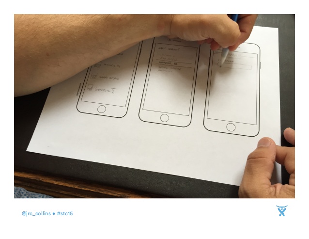
Prevailing business and design wisdom focuses on “mobile-first”, and top designers agree that starting with mobile rather than the desktop makes practical sense. You can start experimenting with mobil-first design process using some blank mobile phone screens here (based on the iPhone 6): http://www.interfacesketch.com/iPhone-6-template-US-letter.pdf
Additional resources suggested by John: http://www.intersectux.com/blog/2015/06/22/resources-tech-writers-sketching-wireframing/