Author’s note: This review aims to help you decide whether or not the Adobe’s release FrameMaker 2017 is worth the money for you and your organization. Although I do work with Adobe on various occasions, presenting FrameMaker workshops and representing Adobe at some of the smaller conferences around Europe, I have no formal connection to Adobe, and views expressed in this review are my personal views.
 How do you develop a product that suits the needs of a community that you are not yourself part of? Neither developers, nor product managers of large software companies like Adobe serve in roles as working technical writers. To get deep insight on the needs of technical communicators, the Technical Communication team at Adobe has actively sought input from the tech comm community over the past years. That input leads to many product improvements the community adopts gladly. True to form, The Adobe FrameMaker (2017 release) gets high praise from this group of expert users.
Whether or not the latest release gets your juices running probably depends on the type of work you are currently performing, with earlier versions of FrameMaker or with another product with comparable features. To make this decision easier for you, I’ll concentrate on the main changes according to a small number of categories.
User interface overhaul?
Use of the word “overhaul” connotes a level of change that I don’t think is entirely justified here. Adobe did make many small changes and a couple of bigger ones. These smaller changes involve simplification of a number of dialogs and pods (such as the hopelessly overcrowded Paragraph Designer). While the Adobe developers performed a lot of work to realize these changes, I think the impact on the life of average Frame users will be limited. However, the bigger changes are a different story, so let’s go into more detail below.
Welcome screen
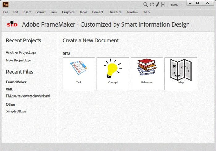
The most obvious change – which you see immediately when starting FM2017 – is a fully redesigned welcome screen. The entire available space now holds a larger collection of templates, a potentially much longer list of recently opened files and a variety of learning resources. Devoting more screen real estate to all kinds of links can go horribly wrong (think of the Windows 10 Start menu, where every tile is screaming at you to try and get your attention). Fortunately, the UI designers kept things clear, well-organized and modestly designed. Just what you need, nothing more.
But wait, there is more to say about this screen. It is actually an HTML page with a bunch of Javascript functions filling in the blanks. This opens opportunities for those who are not afraid to open the hood (or bonnet, depending on your locale) of the FrameMaker 2017 vehicle. With just a little bit of HTML and JS coding, you can customize your welcome screen to your personal taste. Instead of just one unordered list of recently opened files, I have them categorized in collapsible sections. I also removed the learning resources and unwanted templates and replaced the icons for the remaining templates with my own. And just for fun, I decided to brand the welcome screen. I took just over 15 minutes to get all of this done.

Customized Welcome screen in Adobe FrameMaker (2017 release)
Rearranged menus and visible shortcuts
Adobe put some effort into reorganizing FrameMaker’s sometimes overcrowded menu bars. They removed a number of menus, locating the commands elsewhere to yield a somewhat more intuitive GUI. If you’re one of the FM users who glued their hands to the keyboard and kept the famous FrameMaker cheat sheet with all those 100s of shortcuts always within reach, you might rejoice. Adobe moved the shortcuts to where they should have been in the first place —next to the command names in the menus. Personally, I am not entirely happy with this feature, as it does make the menus look messier. That’s because most shortcuts involve four keystrokes, often starting with the Esc key. I was looking for the option to switch the shortcuts off again, but have not yet found it. I have memorized the shortcuts for the commands I use most, and for the others there is a much better method now.
Direct access to all functions: F7
Better than the reorganisation of menus and showing shortcuts next to the commands is the new command finder dialog. Just hit F7 and start entering the name of the command you are looking for. The list of available commands is automatically filtered with the characters you type. No more looking for commands in menus and submenus. I suspect that some of us might actually prefer this method over any menu access, since we do not need to grab the mouse anymore. It might even be faster than typing the escape sequence for some of the commands.
Dragging images into your document
Previous versions held onto a cumbersome method of importing images, and Adobe has completed an impressive redesign. Before 2017, you had to go through FileInsertFile, then navigate your file system, select your image file, then set the import parameters. Often, your first guess at DPI settings would be wrong and you had to go through another round of clicks to correct that.
A lot of mouse movements and clicking to do something that should have been much easier. And it is much, much easier now. Just make sure you can see the destination for the image, open a Windows Explorer window, find the image and drag it into your document. If the image is larger than the available width, the DPI is automatically adjusted. And it does not matter which format your graphic file has. As long as it is recognized, you can drag it to where you want it to appear.
However, if you are not working in structured content, you will hit one snag. Dragging the image to another location would have been a very useful feature for unstructured, as it is in the Structure View. Unfortunately, if you drag the image out of its anchored frame, it appears as a floating image at the destination. Trying to drag the anchored frame causes the same error that previous versions displayed. The image should behave the same way whether you were dragging it from the explorer, another FrameMaker document, or another location in the same document. I hope that Adobe will address this in one of the upcoming patches.
Managing your projects in FrameMaker 2017
If you take a close look at my customized welcome screen, you’ll see a new type of recently opened file, using the extension “fxpr”. This indicates the best enhancement of this new FrameMaker 2017 release, and may well be the best, if not sole, reason for upgrading.
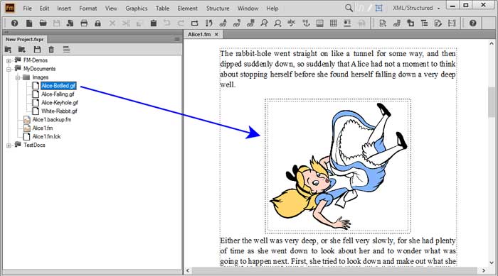
Once you have used the new Project Manager to organize your materials, you will never want to do without them. You can add any folder to the project to make them available in the project manager window. Apart from having quick access to your FrameMaker files, this also greatly enhances image handling. You simply open the containing folder in the project manager, and drag the image into your document. After you do this just once, you will wonder how you have survived all the clicking and searching that was required in earlier releases.
Switching from one project to another is very easy with the Project Manager. Close all current files, then open another project (that is why I have customized my welcome screen). Now you can quickly open any individual files and get to work.
I have not had enough time to test all the options in Project Manager, but this new feature is certainly going to be among my best friends for the years to come.

The Project Manager in FrameMaker 2017 makes managing multiple projects and dragging images into a document even easier
Customizing your HTML output
In earlier releases, you had an HTML5 Responsive Design template, for which all kinds of properties could easily be changed, using a built-in WYSIWYG styles editor. The FrameMaker 2017 release enhances the editing capability to cover sections in the HTML pages you create for even more flexibility than before. A truly interesting new option is the Basic HTML output, which converts your materials into HTML without any of the bells and whistles of a more elaborate template. If you have your own web CMS and merely want to inject HTML content into it, this feature will suit your workflow to a tee.
Dynamic filtering done right (for DITA content)
FrameMaker 2015 introduced the dynamic filtering feature. You can define a set of categories and conditions that allow your users to filter the HTML5 content to hide some of the materials at will. This produces a more adaptive user experience, where the user has control over what they see.
Adobe enhanced this incredibly use feature in the 2017 release to make use of existing filtering attributes in DITA content. With other DITA publishing platforms, you define the filtering criteria as part of your publishing process, and you will have to create multiple outputs for multiple audiences. With the dynamic filtering option in FrameMaker 2017, you can publish one single set of output files, and give the users the choice what they need to see.
Conclusion
Is FrameMaker 2017 the best release to date? Yes. The developers have added impressive new features while simplifying the user interface, and that is not a trivial achievement. Should everyone immediately upgrade to this version? That depends on your current situation. If you are not using FrameMaker with a repository or content management system, the new Project Manager feature alone is worth the cost to upgrade. Taken together — the simplified user interface, plus Project Manager, as well as HTML and template improvements — the improvements make a purchase of or an upgrade to Adobe FrameMaker (2017 Release) well worth considering.