 Enterprise UX
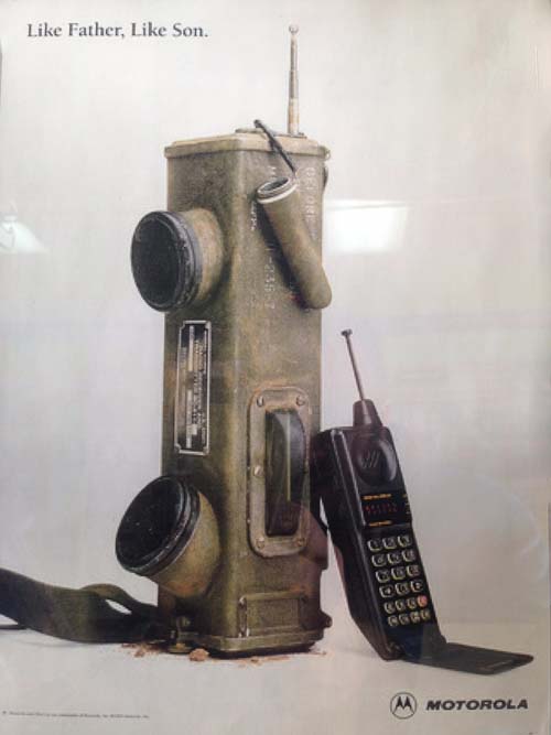
Motorola’s SCR-536 Handie Talkie is ghastly, clunky, and it sure isn’t going to fit in anyone’s pocket that we know of, right? However, after a quick glance, one may see how far technology had come or marvel at the flip phone’s compact size. However, things change dramatically when it becomes your actual job to make a phone call. When lives depend on your ability to call in an airstrike or a medical evac, the designers must reevaluate how they’re going to put together your technology. The giant Handie Talkie needs to always have a signal, work in the rain, mud, and snow. Perhaps even be shot at or take some hits from shrapnel. Lives are depending on it. Suddenly that flip phone doesn’t sound like such a good option, right?
Consumer UX
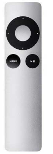 Have you used a gen 2 Apple TV remote? It’s small and easy to use, right? Until you’re watching Game of Thrones and the kids are making noise in the hallway. So you try to turn up the volume. Wait, hold on, this darn Apple remote doesn’t have a volume control on my TV. Exasperation sets in as you go rifling through the couch and pillows searching for the native TV remote so you can hear the action. KISS (Keep It Simple Stupid) is a failure–turning up the volume became such a hassle, because the design was too simple. This design lacks features that a user in his normal environment needs and wants, so it becomes useless. It turns out that while simplicity is a good philosophy, there comes a point where it can fall apart. As shown with the Apple TV remote, there’s such thing as too simple. Sometimes users want simplicity, sometimes they want power and complexity. Sometimes pretty isn’t usable (Apple remote) and usable isn’t pretty (Handie Talkie).
Who Are Consumers, Who Are Professionals?
Some of us who use software on a daily basis for our livelihood have split personalities. The first is our sharp professional brain that thrives on creativity, flexibility, speed, accuracy, organization, or collaboration with others. Our software designs need to account for that. The second is our 6 pm – 11 pm mashed potato brain that craves simplicity–few options and minimal distractions. So those interfaces then need to account for that, too!
Let’s look at the example of a professional sonogram technician. A technician taking head and chest measurements of a fetus via sonogram has specific (and usually complex) expectations about what she can do with the software. However, when she goes to Panera Bread for lunch to order soup and salad via touch-screen-kiosk, the experience needs to be far less complicated. We’re talking, “point…click…swipe card…eat!”
Our consumer mind sees the software as an obstacle between us and what we want. As a result, many consumer experiences aim to make the software almost invisible by transforming the object of desire into an interface (like tapping a picture of a BBQ Chicken Salad). Our professional mind sees software as a servant, akin to Luke Skywalker’s faithful droid R2D2. Enterprise experiences need to offer far more complex capabilities in a way that allows the user to do exactly what they want 99.9% of the time. Consumer UX “already knows” what we want.
 Does that mean consumer UX is easy and enterprise UX is much harder? No. Consumer UX aims to hide complexity from the user–and that’s very challenging. Enterprise UX tries to offer the user the right amount complexity–a totally different challenge.
Clearly, designing for pros and consumers is tricky, they have very different needs. We tend to make things we like to look at, not what we like to use. We tend to search for one all encompassing design aesthetic, instead of a design approach. We tend to design for ourselves, not our users. It’s human nature, but we have to fight those urges. User observations, empathy, and understanding context help designers avoid poor UX.