 Flare is a relative newcomer to the tech docs world, debuting in 2006. But MadCap has been busily extending it, with its tenth release this week (March 4) offering major new features and many enhancements. In this review, I’ll focus on the major features – HTML5-based responsive output, slideshows, Eclipse Help, and project export – then review what I see as the major enhancements.
HTML5 Publishing and Responsive Output
To fully appreciate the major feature enhancements available in MadCap Flare 10, you might need this brief overview of HTML5 and responsive output.
HTML5 Concepts
HTML5 is the successor to XML and older versions of HTML. It’s a coding language and, in Flare 10 (and 9), a browser-based output. You can still use WebHelp for browser-based output, but HTML5 has some benefits that may make you re-think WebHelp.
- Searchability by web search crawlers/spiders/bots. WebHelp has worked fine for years but has a problem that wasn’t evident until web crawlers appeared. WebHelp uses an older “frameset” technology to create the “paned” look of our outputs, but framesets block web crawlers from going deeper into the output than the home page. The result is that online content distributed as WebHelp won’t be found by web crawlers and won’t appear in a list of search hits. In other words, users won’t be able to find your content through public search engines. This may be irrelevant if your output is behind a firewall or login screen and thus only available to customers. But if your company is adopting a more open strategy with public-facing content, the frameset-block is a strategic limitation. HTML5 fixes it. The output still looks like it’s using framesets but it’s not, so users can find your output using Google et al.
- Support for CSS3. This extension of the CSS (Cascading Style Sheet) standard adds power and flexibility for formatting under modern browsers.
- Support for “hybrid” mobile apps that are based, in part, on HTML5. Flare doesn’t output hybrid apps, but the HTML5 code that it does output forms part of the foundation for those apps. In other words, HTML5 output is a step toward hybrid apps.
Responsive Design Concepts
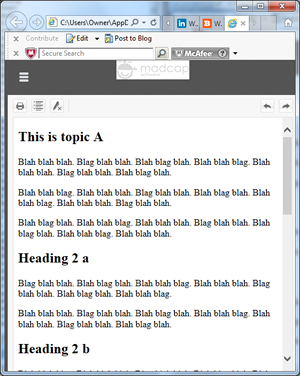
The need for responsive design arose as new devices with differing screen sizes and resolutions continue to appear. Instead of optimizing our output for desktop PCs, we have to optimize for many smartphones and tablets with different properties. We could optimize for a few of today’s devices, but this will quickly become cost-prohibitive as new devices continue to appear. But we still want our output to look good on any device on which it displays. The answer is “responsive output”.
Responsive output lets content automatically change its design based on the properties of the device on which it’s displayed – so-called device-agnosticism. This HTML5 output can change its design and even its content depending on whether it’s appearing on a smartphone, tablet, or PC. For example, the image below shows responsive output on a standard desktop PC monitor. Notice the MadCap logo at the top left, with its black background, and the navigation panes on the left.
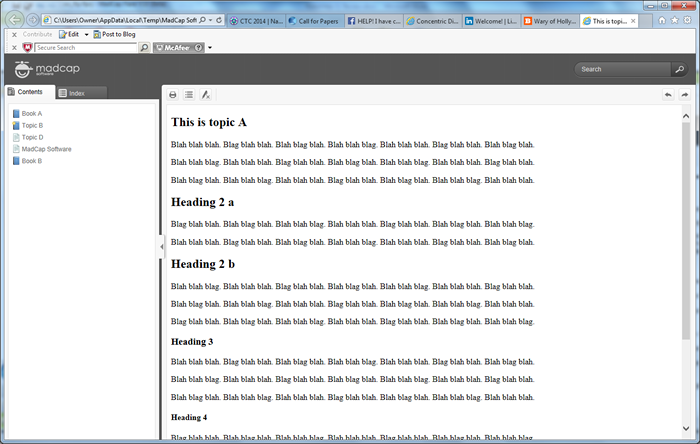
The image below shows the output from the same project but in a smaller browser window to simulate a tablet. Note the new position of the logo and the now-hidden navigation panes. This change is tied to a “breakpoint,” a device size at which different skin settings take effect, set up in the HTML5 Skin Editor.
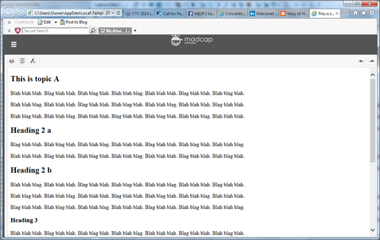
The image below shows the output from the same project in a still smaller browser window to simulate a smartphone. Note the icon’s different background color. I tied this change to a still smaller breakpoint and defined it using the HTML5 Skin Editor.
The fact that the design differs depending on the device may not seem like a big deal. We can do this by creating different outputs, each designed for a different device. But the example above is from one output that automatically tailors itself. You still have to define various skin settings and the breakpoints where the design changes, but you’re doing this once for one output.
I consider responsive output to be the most significant feature in Flare 10 because it represents a core change in how tech comm works, comparable to the effects of online help in the mid-‘80s, the shift to HTML in ’97, and the support for mobile that appeared in HATs like Flare starting a few years ago. With responsive output, tech comm is on the verge of being able to publish to any device, including but not limited to “mobile.”
Flare’s Support for HTML5 Output and Responsive Output
Flare 9 added support for HTML5 output and added it fairly smoothly to the interface. Some options had different names and were defined in different places than the WebHelp equivalents but they were close. Flare 10 adds a new, easier-to-use HTML5 Skin Editor and added responsive output as a set of new options on the HTML5 Skin Editor and Target Editor. You turn on responsive output on the Target Editor’s Advanced tab, set breakpoints on the Setup tab of the HTML5 Skin Editor, and set various other display options on the HTML5 Skin Editor.
Responsive output offers additional options that will likely be included in later versions of Flare, like the ability to specify more than two breakpoints. (Right now, the limit of two breakpoints means you can set options for smartphones and tablets, but can’t distinguish between 7” and 10” tablets for example.) But this simple enhancement makes it easy to experiment with responsive output. It’s an excellent start.
Slideshows
The slideshow feature is conceptually simple – you add a series of horizontal slides containing images or other types of content including, from the help, “…snippets, text, tables, and more…” in a topic. This, as the help says, “…can be especially useful for showing a gallery of images or videos…” Users can navigate between slides by using arrow buttons on either side of a slide or the row of dots, the “pager”, below each slide. (You can also replace the dots with thumbnail images).
The image below shows a topic with a slideshow, showing slide 1, below the first paragraph. (Ignore the spelling errors. I generated the images using a beta version of Flare 10 in trial mode and Flare randomly inserts spelling errors in trial mode. They disappear when you enter a license key.)
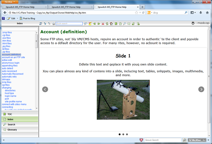
You can see the navigation arrows on either side of the slide and the pager dots below the slide. The next image shows slide 2 within the same topic, this time with a table.
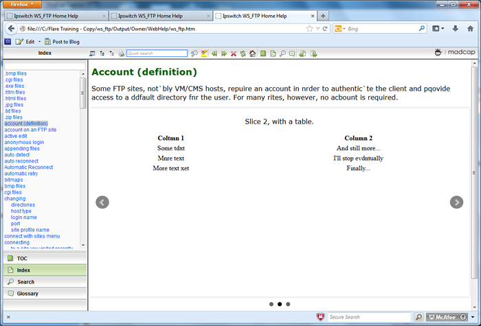
In addition to showing “a gallery of images,” I think the slideshow feature could solve an age-old design problem inherent in task description topics. A good rule of thumb in designing topics containing a list of numbered steps is to avoid inserting links that take users out of the list, or thread. This rules out using jump links. Authors typically use popups, dropdown, or togglers instead, but each of these types has a drawback. Popups cover up part of the main topic and can only contain so much material. Dropdowns don’t cover the main topic but can still only contain so much material before readers start to lose track of their vertical position in the main topic. Togglers can have so many chunks of content popping up all over a topic that readers can again start to lose track of their vertical position.
The slideshow, in my opinion, eliminates these problems by letting authors add as much material as they need to the slideshow but without changing readers’ visual location in the topic. In other words, readers get to a slideshow, view it horizontally, then continue reading vertically. This could be very useful in any task description topic containing numbered steps but that also contains long, complex asides.
Eclipse Help
I’ve done very little with Eclipse Help so I’ll leave it to other reviewers who have to describe it in detail. (For an overview of Eclipse Help, see “Documenting Your Project Using the Eclipse Help system” at https://www.ibm.com/developerworks/library/os-echelp/.)
Flare’s support for Eclipse Help makes it a useful option for Eclipse developers. Flare’s features let you create standalone documentation or context sensitive help, create help that can run from a server or locally, and distribute the output as a set of files in a folder or encapsulated as one JAR (Java Archive) file. Note that using Eclipse Help in Flare requires some additional setup work, including downloading and installing the JRE (Java Runtime Environment) and Java v.7, Update 45, on your PC.
Project Export
This feature is an extension of the Zip Project feature (in the Save group on the Project ribbon) that Flare has offered for several versions. That feature is an easy and quick way to zip up a project for archiving or to send to another destination – to send to a laptop for authoring while on the road, for example. The Zip Project feature’s limitation was that it simply zipped up the entire project and saved it to a location or attached it to an email. The Project Export feature goes further.
With Project Export, you can still zip up a project but now have the option of extracting and zipping up a subset of the project based on output targets, conditions, or file tags – all files that form the Canadian HTML5 target, for example. You can also save the exported project as an exported project, zip it up, or save it as a Flare template. (This latter can be very useful but puts a lot of pressure on the author to use careful and accurate project names to avoid winding up with a collection of confusingly-named project templates.)
Additional Enhancements
This release has numerous smaller enhancements. It’s impossible to say which ones are most important to which developers, so here are my preferences in no particular order:
- Conditionalization of individual objects on an image map. Conditionalization is a mainstay part of single sourcing, but the inability to conditionalize objects on image maps meant that either you didn’t use image maps for single sourcing or created multiple versions of each image map and conditionalized each one, which added a lot of work. If you need image maps in your single sourced output, image map object conditionalization will be a welcome addition.
- The File List pane opens in the full Editing pane rather than the narrow left pane (or right pane if you customize the interface). It’s a small change but a convenient one because the wider Editing pane makes it easier to see more File List information without horizontal scrolling.
- Improved find and replace. The Find and Replace features have been taken out of the right pane and integrated into the topic editor as Quick Find and Quick Replace. You’d use these to find (or replace) text in the file that you’re currently working in. This will take a few minutes to get used to if you’re a long-time Flare user, but it frees up more screen space for the topic.
- Improved find and replace in multiple files. There have been a number of enhancements to this screen, including the ability to search more widely in a project and in a wider range of content types, as shown in the two images below.
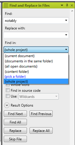
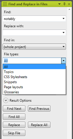
If you do a lot of search and replace, or work in code, these changes add a lot of search power but they have to be used cautiously. Work carelessly and you could make a global change to your project’s control files and corrupt the project.
- Improved and extended HTML file import. MadCap has been improving this feature for several releases and v.10 adds some welcome touches, including the ability to create a folder to hold the imported file (no more having to stop the import, create the new folder, then re-start the import if you forgot to create the receiving folder in the first place), linking the imported HTML file’s topics to the original HTML file on the server (as with Word and Framemaker import), plus two new tabs on the import results screen that let you view the original and converted versions. I like the idea of being able to compare my original file and the converted results, but I don’t like the fact that I can only see one tab at a time. I’d like to be able to see both tabs at once, and be able to highlight text in one tab and have it highlight on the corresponding section of the other to make it easier to check the results. I’ve proposed this as a feature request.
- Separation of errors and warning in the Build Progress dialog box. Previous versions of Flare showed this when you generated your output:

Flare 10 changes it to this:

The result is a less terrifying error report. You can also tell Flare to ignore and hide certain types of error reports. I have mixed feelings about this; it’s nice to turn off the display of errors that you don’t care about but it’s easy to forget that you turned off the display of those errors and instead assume that you hadn’t made them. - Automatically adding proxies (placeholders) to add a table of contents, index, and other front or back matter to print output like PDF. In prior versions, it was easy to add those items by creating and inserting specialized topic types in the master table of contents but the process wasn’t intuitive. Being able to add them automatically will simplify the process and help authors create better print output. Note that the automatically-added items are the basic forms. You have to add them by hand if you want to customize them but the basic forms may suffice in many cases.
- Comments for style classes in the Stylesheet Editor. This is useful if you create or maintain style sheets because it lets you add explanatory comments without having to go into the actual code. That doesn’t mean authors will comment their code, but there’s less excuse for not doing so.
- Displaying the mouse pointer’s line and character position when working in the Text Editor. This small change will be a big help if you work in code and have to fix coding errors whose position is indicated by a line and character number in the error message. Prior versions of Flare listed line numbers, but you had to count characters by hand – a tedious job and easy to get wrong. Showing the position indicator fixes that.
I’ll stop here. Look for the “What’s New” information at MadCap’s site for more, and download a trial version or request a demo.
Summary
The most important new feature in MadCap Flare 10, in my opinion, is the new responsive output. Few of my Flare training and consulting clients are at the stage of needing that feature but almost everyone I talk to is aware of the explosion of new devices and the possibility of having to support them. Responsive output will let them do so without being a programmer.
Do you need to upgrade to v. 10? You can probably stay with 9 if you don’t need responsive output now. But if you’re using a version prior to 8 or 9, and certainly if you need to support a varied and growing set of devices, Flare 10 is a worthwhile upgrade and a job well-done by MadCap.
