Traditionally tech comm has tried to steer clear of marketing and all its works. In Techwhirl, Alissa Martine and Alan Houser took up cudgels while Brett Peruzzi tried to make peace and the list has agonized over the differences. Sarah O’Keefe has been urging us to end the cold war between tech comm and marcom for a while now, but many tech writers still seem to have a strong aversion to anything that smacks of marketing, regarding it as either fluff, or outright dishonest.
Here’s the problem, though. The buyer is a user too. In many ways, they are the most important user, because it is the buyer who may, or may not, part with the cash that goes to pay our salaries. And here’s the real kicker: what works for the novice user, or for the expert user, does not always work for the buyer.
Bruce Tognazzini, usability guru and the original author of the Apple Human Interface Guidelines, wrote a column recently talking about why Apple’s current products are breaking many of the fundamental rules of good UX.
Apple keeps doing things in the Mac OS that leave the user-experience (UX) community scratching its collective head, things like hiding the scroll bars and placing invisible controls inside the content region of windows on computers.
Apple’s mobile devices are even worse: It can take users upwards of five seconds to accurately drop the text pointer where they need it, but Apple refuses to add the arrow keys that have belonged on the keyboard from day-one.
So how do we square these lapses in UX with the fact that Apple is selling piles and piles of iStuff and maintaining a public reputation for ease of use? The answer, Tognazzini argues, is that Apple has its eyes fixed on a user that the UX community is ignoring, what he calls the “third user” — the buyer.
Apple’s message of simplicity and ease of use is being sold to the buyer in the store. That ease of use is an invitation to step over the threshold. But if the display shows all the tools and controls that make the interface easy for a novice to learn and for an expert to use, it does not look easy to use at first glance. Tognazzini explains:
What do most buyers not want? They don’t want to see all kinds of scary-looking controls surrounding a media player. They don’t want to see a whole bunch of buttons they don’t understand. They don’t want to see scroll bars. They do want to see clean screens with smooth lines. Buyers want to buy Ferraris, not tractors, and that’s exactly what Apple is selling.
Where Apple is falling down today, Tognazzini argues, is that it is so focussed on the buyer, it is making life difficult for the user:
“Gee, the screen looks so clean! This computer must be easy to use!” So goes the thinking of the buyer when seeing a document open in an Apple store, exactly the message Apple intends to impart. The problem right now is that Apple’s means of delivering that message is actually making the computer less easy to use!
His prescription for Apple is simple: turn the UX features that let people get work done back on after the sale is made. For the UX community, though, his recommendation is to expand its horizons. The tech comm community needs to hear the same message.
Neither Apple nor the UX community, he says, is paying attention to the full user spectrum:
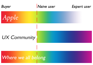
(Image courtesy of Bruce Tognazzini, used by permission.)
Apple, on this chart, focusses on the buyer and a little bit on the naive user, but ignores the expert user. The UX community focusses on the naive user and the expert, but ignores the buyer. Where both need to be, he argues, is the bottom bar — the one that cover the entire user spectrum.
If we were to plot tech comm on the same chart, it would look like this:
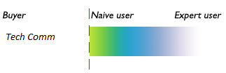
Where Tech Comm falls on the buyer-naive user-expert user spectrum
As we inevitably move more and more to the Web (inevitably, because that is where the users are, as I noted in my last column), this lack of focus on the buyer will become more and more of a problem, for two important reasons:
1. On the web, the buyer sees everything
When we delivered books in a box, chances are the documentation was not something that the user got to see until after they had bought the product. (It has been noted how plain and utilitarian documentation looks compared to glossy marketing material for the same product.) But once documentation is on the Web, it is part of what the buyer can see, and part of how they form their impression of the product.
So what kind of impression does it give when the documentation looks like this?
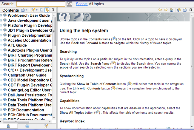
The buyer as a user sees documentation on the web and forms an impression of the product
Not only does that massive table of content scream that the product is complex and difficult, you even have to read instructions on how to use the help system. Help!
It is no wonder the marketing department is sometimes hesitant to have the documentation available on the website. It is actually something of a conundrum for them. On the one hand, the documentation is lots of keyword rich content that makes for great SEO, on the other hand, the way much of it looks today, it is the last page they would want someone to land on.
The broader conundrum for the company is that if you want to support your users by providing rich help content, you need to make that content available in the main place they look for it, and that is the Web. But if you put many current documentation sets on the Website, they could scare children and small animals.
It does not have to be this way at all. You don’t have to slap the user in the face with a massive TOC and a bunch of unfamiliar help system controls. You can put up documentation that looks like Web pages are supposed to look:
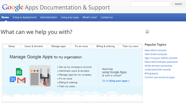
Google creates documentation that looks like web pages should look
Or this:
WebMD creates documentation on the web for the web
Both these interfaces lead into large bodies of technical information, but neither rubs your nose in it, and neither demands that you learn a special interface to use them. You just point and click. This is the kind of documentation that reassures the buyer rather than alarming them, but which still provides all the content that the novice and the expert might require.
2. The user is a buyer when it comes to documentation
The second reason this is important is that while the user may already have bought the product, that does not mean they have bought into your documentation set as a means to solve the problems they are having. This is not the old days when the manual was all they had. Now the Web is at their fingertips with many possible sources of information available.
No small part of the puzzle of why users don’t read the documentation is that we have been doing a lousy job of selling it to them. In the days when tech comm enjoyed a monopoly on the provision of technical information we could afford to be a little arrogant. We could wash our hands of the demands of commerce and aim our docs squarely at the novice user.
We tested for usability, but we tested in how usable our docs were to test subjects in a lab, and usually made using the docs part of the assignment. We seldom tested to see if people would voluntarily pick up the docs of their own accord, or to see if the docs affected their decision to buy the product.
That is not enough today. We have to create information that appeals to the buyer, is usable by the novice, and is complete enough for the expert. We have to think about the whole user spectrum.
And we have to have a good answer for the question that will inevitably come sooner or later from the corporate bean counters: if people can can get help on the Web, why do we need to create documentation at all?
The only answer to that question that is going to fly is the only one that even flies with bean counters: more beans. But to have the documentation actually start to generate beans, it is going to have to address the entire spectrum of users, from buyer to novice to expert. We are going to have to show that it benefits the company for the entire user spectrum to get their information from our content rather than, or as well as, from community content.
For that to be the case, our content has got to help sell product. It has got to reassure buyers, rather than scaring them. It has got to get novices up to speed quicker, so they become productive more quickly, thus reducing the cost of ownership for our customers. It has got to allow experts to find information quickly and reliably so that they will recommend our product to other people.
Today it is all about the customer, and every customer begins as a buyer. Tech comm has to start serving the buyer, and, indeed, serving the whole of the user spectrum.