When we design visual information, we have many tools at our disposal to increase the likelihood that our audience receives the message we want them to receive. Gestalt theory helps us accomplish this by explaining key aspects of how we perceive images, and specifically how we identify the figure (the message part of the image) and separate it from the ground (the background or context on which the figure rests).
Strictly speaking, it’s more correct to say that the figure is what emerges from the whole image, and that it is not truly separate from the ground. Saying that “the whole is greater than the sum of its parts” is a familiar way of expressing this concept, and one goal of learning information design it to understand how to create that whole from many smaller parts. In gestalt psychology, this whole is referred to as totality: when we perceive an image, we examine all of its components (subconsciously first, then consciously), weigh them against each other, identify the important ones, and decide how the parts, working together, convey a message.
Clearly, understanding gestalt theory is important for anyone who wants to master information design, not to mention visual design disciplines such as instructional design and user-interface design. But this understanding is important even when all we want to do is create a simple graphic such as a bar chart or an annotated screenshot. Four main principles of gestalt-based design provide this understanding and the tools we need to use it in practice:
- Emergence
- Reification
- Multistability
- Invariance
Don’t let the names scare you. In this article, I’ll show how these principles are simple, yet highly relevant in technical communication—but I’ll also critique them and provide guidance on how you can use the theory in your daily work.
Emergence in Visual Design
Emergence is how we perceive images as a whole rather than assembling them by consciously interpreting their component parts. For example, when we recognize the face of a friend, we don’t consciously examine each of their facial features and compare the resulting list against a mental checklist. Similarly, we can rely on viewers to subconsciously recognize that something is a screenshot of a menu rather than one of a dialog box. That being said, viewers must make some conscious effort to go beyond this recognition: they must determine which specific menu they’re examining (e.g., File versus Edit), and must figure out why that is relevant.
When we design a graphic, several thought exercises let us help viewers move from recognition (“this is a screen shot of a menu”) to understanding (“this shows me the location of the Track Changes feature”). To support this understanding, we must implement the details of the image in a way that facilitates emergence. For example, consider the task of presenting changes in a company’s income over time using a graph. Five simple steps help us choose an appropriate design:
- Identify information that provides context, and label it clearly. “Income” and “time” provide the context, and traditionally, we place them on the graph’s vertical and horizontal axes, respectively.
- Identify the data we will present in that context. Here, the data is a series of income values, each associated with a specific date.
- Clearly label the axes of the graph and follow standard conventions to help viewers determine the meaning. For example, in English time moves from left to right along the horizontal axis.
- Identify the minimum amount of visual information required to communicate the meaning of the data. A bar graph works, but a line graph is more efficient because it eliminates unnecessary information (e.g., the width and color of the bars) that competes with the message (i.e., the incomes) for the viewer’s attention.
- To focus attention on the part of the image that contains the message, point out the important things. We can do this using arrows to point at specific incomes or we can use subtler tools such as using black to indicate profits and red to indicate losses.
We can use the same approach in other technical graphics, such as illustrations of a digital camera that we’re documenting. A drawing can be more effective than a photograph because it eliminates detail that obscures the context and focuses attention on the remaining details, which are what convey our message. For example, the color of the camera and the texture of its surface are unimportant; the locations of the power button and the focus knob are. Progressively eliminating textures and colors and lines from the image until all the remains are the lines that are essential to recognize “this is a camera” (i.e., until that recognition emerges) is a useful approach. With practice and experience, we can learn to start closer to that minimum and waste less time deleting unnecessary details. This approach to visual design is often described as minimalism. For more information and copious examples of how it works, there’s no better resource than Edward Tufte’s books The Visual Display of Quantitative Information and Envisioning Information.
Reification

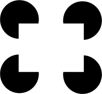
Figure 1: An example of how reification causes an image to emerge
Reification is what happens when we perceive an abstract concept such as “digital camera” based on the sensory cues received by our eyes (light reflected by the object); these cues magically transform into an abstract concept (“something I can use to take photos”). That image in the mind’s eye is clearly not the physical object we’re looking at; when we see the camera, it doesn’t suddenly appear inside our head. (Ouch!) To make this more concrete, consider how we can make viewers recognize a rectangle without actually drawing a rectangle (Fig. 1):

Figure 2: Reification of a drop shadow to create a three-dimensional effect.
There is no rectangle in the image, but the sensory cues provided by the image almost force us to infer its existence. Does that seem a bit abstract? Consider this: In technical communication, creating such rectangles without actually drawing them is a common task. Whenever we lay out a page, we must convince readers there are one or more columns of text, each of which exists as a separate image. We could certainly draw a thick black rectangle around each block of text to identify it, but we almost never do. That’s because reification does the work for us. Returning for a moment to the concepts of figure and ground, the white space between the columns of text functions as the ground, and the text itself functions as the figure. We have not painted the white space on the page using white paint or its pixel equivalent, yet it nonetheless creates an imagined barrier that separates the two blocks of text. Similarly, when we use a “drop shadow” to create the impression of a 3D image (Fig. 2), the black box that we use to create the shadow is real, but the 3D image is not: the page remains as flat as any other page. Yet viewers reify that box to interpret it as a shadow, and use that knowledge to understand that we want them to imagine that the image is floating above the page.
To create an effective image, we should follow two reification-related steps to understand how to create the image:
- We must understand the explicit signals that will cause reification to occur. Actual shapes, created with clearly visible lines, are an obvious example.
- We must also take advantage of implicit signals. White space is an obvious example. We should preserve white space when it conveys a message, and eliminate it when it obscures that message.
Avoid Multistability in Visual Design

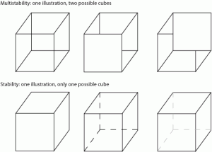
Figure 3: Examples of (top) how a line drawing can be multistable and (bottom) how to clearly indicate which of two possible stable images we want the viewer to see.
Multistability is the concept that some graphics may appear to alternate between two stable images when the sensory clues we provide are ambiguous. A line drawing of a cube is inherently multistable because the crossing lines make it difficult to understand which lines represent foreground and which represent background (Fig. 3):
Multistability generally isn’t a good thing, so we should avoid it wherever possible because it makes our message ambiguous. In the example of the cube, eliminating lines in the background (i.e., lines that we could not see from our current position in front of the cube) is a good solution. If the presence and position of those background lines is important, we can indicate their existence using lighter tones or a gradient fill that makes the lines fade into the background.
Invariance
A visual image is invariant if we continue to interpret it as the same object even if we change its orientation (by rotation), its size (by magnification), or its position (by relocation). However, images are not equally recognizable in all orientations, sizes, and positions. For example, text is easily recognizable as text, no matter its orientation; this is why we recognize that sideways text on the vertical axis of a graph is still text. But if we flip a figure caption to create its mirror image, reduce the type size to 4 points, and move the caption far from the figure it describes, we make it unnecessarily difficult for reader to read and understand that text.
Designing a visual image based on the assumption that invariance is sufficient for clarity leads to communications failures. For instance, a page number won’t be instantly recognized as a page number if it is vertically centered on the page, between two columns of text. The number does not change just because we changed its position. But because it does not appear at the top or bottom of the page, outside the main text area, we won’t recognize it as a page number until we notice that it appears on every page and increases moving from left to right. Invariance is not sufficient because our audience uses learned conventions (e.g., that page numbers appear at the top or bottom of a page) to understand visual information. Unless we have a good reason to ignore or subvert those expectations, we should stick with what they already know.
If you’re thinking that invariance relates to consistency, you’re right: visual information must be externally and internally consistent. External consistency means that the information follows the conventions the rest of the world uses to present a given type of information, such as in my example of the location of page numbers. Internal consistency means that within a document or graphic or Web page, each type of information must be consistently (invariantly!) labeled: all headings of a given level must be boldfaced (or not), centered (or not), and use the same font (typeface, size, and emphasis); bulleted lists should use the same bullets, and numbered lists should use the same numbering scheme. Compare, for example, the two following lists:
Good:
|
Bad:1. The first item.
– 2—The second item. 3) The third item. |
Grouping related things supports gestalt
Many aspects of visual design are implicit in gestalt theory, and it’s worth making them explicit. The four gestalt principles I’ve described help us create more effective visuals by helping us choose the most effective clues for a message and an audience. One of the most important application of these principles involves grouping to indicate which parts of an image work together to serve a single function, and which parts serve a different function. For a printed page, white space separates words from each other, separates one paragraph from the next, and separates the columns of text into groups. Appropriate use of white space (i.e., good typography) lets readers read without paying attention to anything other than the meaning of words; bad use of white space forces readers to consciously separate adjacent letters, adjacent words, or adjacent lines, and makes reading difficult.
Although there are various “laws” of how grouping works in gestalt psychology, it’s better to think of them as proven “best practices” or guidelines for effective visual design. The gestalt laws of grouping include the following:
- Closure: We intuitively fill in gaps in the visual information and draw inferences about what the gaps mean. Despite the gaps between dashes, a dashed line remains instantly recognizable as a line. Despite the gaps between letters within words and between words within sentences, we recognize words as words and sentences as sentences.
- Similarity: We intuitively group things that are similar in size, shape, color, or intensity. As I noted earlier, this is why consistency of heading styles is important.
- Proximity: Viewers create groups from things that are close together and consider group members to be related; conversely, they separate things that are farther apart into separate groups.
- Symmetry: Symmetrical designs group things in ways that lead readers to believe that the groups operate as a single unit. This is why lines or columns of text on a page are typically balanced, parallel, and of equal width. It’s also why symbols such as arrows used to point at several features of a diagram should all be the same size (symmetrical in thickness and length): arrows that are more visually prominent suggest that the features they point to are more important.
- Continuity: We tend to extrapolate from patterns to see where they lead. We learn to look for page numbers at a specific location on a page, and changing that position disrupts that learned skill. If we change the meaning of a symbol between two images, readers who learned the first meaning will apply that knowledge to the next image, even if we warn them about the change of meaning. I frequently catch scientist authors making this mistake when they interpret their own inconsistently designed graphs.
- Common fate: Things moving in the same direction are perceived as being part of the same group. For example, a graph that compares two trends will show both trends moving from left (earlier) to right (later) instead of reversing that order for one trend. Dialog boxes group tabs on only one side (typically at the left or top) to emphasize that they all have the same fate (i.e., clicking on them will always display options beside that tab).

Figure 4: An example of grouping based on physical position and visual characteristics to separate radio buttons from checkboxes.
Combinations of these principles let us establish visually and functionally consistent designs. For instance, the similarity principle is why checkboxes in a dialog box all look alike but differ visually from radio buttons, whereas the proximity principle is why we place the checkboxes together but separate them from the group of radio buttons (Fig. 4). Symmetry and continuity explain why we align the members of each group to reinforce the message that they work together. When such design features are consistent, viewers can quickly recognize patterns and understand components of the design (e.g., checkbox = choose more than one option, radio button = choose only one option) and can use the visual information efficiently.
Putting the theory to the test
Gestalt theory provides a robust way to understand why certain visual design conventions have evolved and why certain design strategies have become best practices. But as the exceptions I’ve described demonstrate, we must use this theory as a tool for understanding how to design, not as a list of rules to follow blindly. Any theory, no matter how powerful it seems, should always be subjected to a reality check. Theory can lead us astray when we use it as a substitute for thinking through a problem, and doubly so when we use it as a substitute for taking enough time to understand how our audience sees, reads, and thinks.
References
Anon. 2011. Gestalt psychology. <http://en.wikipedia.org/wiki/Gestalt_psychology>
Hart, G. 2008. Much ado about nothing, part 1: the importance of white space. Intercom January 2008:36–37. <http://www.geoff-hart.com/resources/2008/white-space-1.htm>
Hart, G. 2008. Much ado about nothing, part 2: deconstructing a page. Intercom May 2008:38–39. <http://www.geoff-hart.com/resources/2008/white-space-2.htm>
Hart, G. 2008. Typography 101A: the role of white space in making lines of text readable. Intercom July/August 2008:30–31. <http://www.geoff-hart.com/articles/2008/typography-101A.htm>
Hart, G. 2008. Typography 101B: the role of white space in making words readable. Intercom December 2008:29–30. <http://www.geoff-hart.com/articles/2008/typography-101B.htm>
Hart, G. 2009. Typography 101C: the role of typeface choice in making text readable. Intercom February 2009: 48–49.<http://www.geoff-hart.com/articles/2009/typography-101c.htm>
Hart, G. 2010. Subjecting theory to a reality check. Intercom Sept./Oct. 2010:27–28. <http://www.geoff-hart.com/articles/2010/reality-check.htm>
Sorflaten, J. 2011. Designing naturally with gestalt in mind. UI Design Newsletter, September 2011. <http://www.humanfactors.com/downloads/sep11.asp#research1>
Tufte, E. 1983. The visual display of quantitative information. Graphics Press, Cheshire, Conn. 197 p.
Tufte, E. 1990. Envisioning information. Graphics Press, Cheshire, Conn. 126 p.