 Many of our tech comm preoccupations are old news—paths that are new to us but well-trodden by others before contemporaneous trends changed. I call this the Ecclesiastes principle, in which “there is nothing new under the sun.” Dieter Rams provides a good example with implications for technical communicators. Rams, a German industrial designer from the functionalist school, followed a philosophy that will sound familiar when I paraphrase it: “form follows function” and “usability is fitness for purpose.” You know his work if you’ve used any Braun products released from the 1960s to the 1990s, when he was the company’s head designer, or if you’ve used recent Apple products, many of which were inspired by his design principles. Rams believed that a good design must be:
- Minimal
- Thorough
- Understandable
- Unobtrusive
- Useful
- Innovative
- Honest
- Environmentally friendly
- Esthetic
I’ve rearranged these design principles from their usual order of presentation to build them into a more coherent argument for highly functional minimalist design that doesn’t sacrifice esthetics. Let’s look at what technical communicators can learn from these principles—and when we should consider violating them.
Minimal
Rams embraced a design philosophy he expressed as weniger, aber besser (“less, but better”), which you may know as the English phrase “less is more”. This has also been attributed to Mies van der Rohe, who believed that the best designs include only the essential elements.
The conventional concept of minimalism involves presenting the minimum amount of information our audience needs to understand what they must do and how they should do it. As a communication design principle, this involves focusing on the design’s essential aspects from a user’s perspective. John Carroll refined this approach to include finding and eliminating the non-essential components of a design; instead of overwhelming the audience with all possible information, the goal becomes one of engaging a product’s user in exploring and creating the missing information themselves. To learn more, look into the two key references to Carroll’s work in the References section.
From a technical communicator’s perspective, this design principle and Carroll’s variant offer two powerful advantages: First, we can do less work because we’re doing only the work that is really necessary. Second, we can do more work in the same amount of time, or the same amount of work but of higher quality. In modern workplaces obsessed with unreasonable deadlines and radical cost reduction, minimalism is clearly an attractive principle. The problem is that minimalism is often misinterpreted as meaning “do the least you can get away with doing.” That’s not the correct interpretation. Instead, we must think in terms of Occam’s principle (also known as the principle of “parsimony”): aim for the simplest solution that adequately explains the phenomenon being described, but don’t oversimplify that solution. The difference is subtle: in essence, we should aim for the minimum documentation that will get the job done, but provide enough beyond that minimum that we don’t leave our audience floundering.
However, “simplest” is a highly subjective term when it’s not supported by a profound knowledge of our audience, their context, and their needs. When we lack this information, simplest risks becoming too simplistic. To communicate successfully, particularly when we don’t know our audience well, we must sometimes err on the side of caution. The better goal is to learn more about our audience, but that takes time. Several articles on my Web site provide useful insights into this topic.
Another obvious problem is that sometimes the practical minimum encompasses everything; that’s true, for example, of dictionaries, a programming language reference, and other types of documentation whose users need to have access to even the smallest detail. But if we understand our audience, we’ll know when this kind of exhaustive effort is required. This leads naturally into the concept of thorough.
Thorough
The logical consequence of “as simple as possible” is that we must not neglect key details, nor even details that aren’t crucial but that are still important. Identifying which details are key or important requires a thorough understanding of what our audience wants to accomplish with the product we’re documenting and how they need to do it. When we examine a process we’ve been asked to document, we must understand both the crucial details (the minimalism approach) and the supporting details that let readers fill in the blanks in the procedure. One excellent, familiar implementation of this design principle in technical writing is presentation of the high-level details as a series of concise numbered steps, usually expressed in the imperative form (“do this, then do that, then…”). These steps provide the essential overview of what must be done, and if Carroll’s approach to minimalism is appropriate in this context, that’s all that most readers will read. But for readers who need more help, each step is followed by a paragraph or more of explanatory text that covers the details. This might look like the following:
1. First, define the key details.
These might be a list of all menu choices a user must select and dialog boxes a user must open to accomplish a task, presented in an efficient order.
2. Next, define the details readers need to understand to accomplish each step.
These include locations of the menu items that lead to the dialog boxes, key settings for each dialog box, explanations of which options are best under which circumstances, and so on.
Readers who already know the basics but need a reminder can simply read the boldfaced steps and ignore the rest. But when they encounter a step that requires more information, it’s presented immediately after the boldfaced heading. This approach works both at a high level (e.g., section headings create a logical sequence) and at a sentence level (specific details and alternatives for each step in the task).
The problem with thoroughness is that it’s sometimes misinterpreted to mean that everything must be documented. That’s often neither feasible nor practical. For example, when we document desktop publishing or CSS software, we can’t afford to teach readers everything they need to know about typography or the merits of every single formatting option: all we can reasonably expect to do is teach them how to use the tools we’re documenting, and leave them to define their own typographic goals. A good way to think of this is in terms of the Pareto principle: first, we must document the 20% that people use 80% of the time. The other 80% of the interface can be accomplished whenever we have time. When planning documentation, you can think of this in terms of triage:
- First, document the things people can’t figure out by themselves; without these things, they’ll fail at the task.
- Next, document the things they can figure out only with difficulty; without these details, they’ll take longer than necessary to complete the task, and they’ll make unnecessary mistakes along the way.
- Last, document (or eliminate) the things that would be useful for them to know but that they can probably figure out by themselves in a reasonable amount of time and with little risk of significant errors.
Understandable
An understandable design clearly reveals the product’s structure. The ideal result of this principle is a product design so intuitive that users understand how to use it with little or no instruction. Think of any vessel designed to hold water, from the crudest bowl to the most sophisticated porcelain teacup, and you’ll see the point of this principle: even a child can quickly figure out how a cup works and how to use it without instruction. Watch children playing with the iPads at the Apple store after they’ve been taught basics like how to get to the home screen and you’ll see how this works from a software perspective. Don Norman’s book The Design of Everyday Things is the Bible of this movement because even today, more than 20 years after it was first released, the book continues to provide profound insights into usable design.
 If the concept of intuitive design sounds familiar, it’s because designers have wasted many years chasing this holy grail of design in the hope they’ll find a way to eliminate the need for user documentation. These efforts have resulted in much more usable products than those they replaced, but have not produced many products that can be used without at least some form of instruction. Any truly complex product requires some way to communicate that complexity, and in most cases, that way is the documentation we write.
From the perspective of creating documentation, “understandable” starts with clear, concise, and effective writing. But now that we’re usually also responsible for designing the printed publication or online help file or Web page we also must understand and follow the design conventions that our audience is already familiar with: for example, long documents should include both a table of contents (at the start) and an index (at the end), page numbers should appear at the top or bottom of the page, higher-level headings should be more visually prominent than lower-level headings, topics should begin with an introduction and conclude with a summary and cross-references, and the current position within the document’s hierarchy should be clearly visible at all times. These conventions must be learned, but once learned, they’re intuitive and require no thought to use.
However, if the context of use changes, the conventional technique may no longer work satisfactorily. That’s a good justification for choosing a new approach that may be unfamiliar, but that can help our audience (with a little training) to work more efficiently than the old approach. This presents its own risks: when a longstanding convention seems boring, it’s tempting to look for more creative approaches even if that boring approach works just fine. Many graphic designers produce attractive but unusable designs because they emphasize self-expression and the desire to do something different over the more important goal of communicating. This leads into the next design principle, namely that the design must not scream so loudly for attention that it steals focus from the information: it must be unobtrusive.
Unobtrusive
An understandable product must, to some extent, reveal its structure. Designers who are too proud of the visual elegance of their design can carry this to extremes; you can recognize the resulting products because they wear their design on their sleeves, where you can’t possibly miss it. The worst of these designs are so aggressively visual that the text is neglected, often being reduced to tiny fonts or fonts so elegant [sic] that they’re hard to read. From a structural perspective, our audience needs to know how all the parts fit together, both for the product and for the documentation. This provides orientation (“where am I now and where do I want to go?”) and context (“what can I do now that I’m here?”).
If we don’t understand the importance of minimalism, we are tempted to provide access to all of the design, which often proves intimidating. When I teach people how to use computers or software, I inevitably find that hitting someone with a product’s full complexity right from the start creates such a strong sense of intimidation that it interferes with the ability to think clearly. (You may have seen this when you try to teach your PhD father or doctor mother how to use their smartphone: they may be smarter than you, but you’d never know it from their flailing with the technology.) I call this problem “steampunk” design. If you’re not a fan of science fiction and haven’t previously encountered the steampunk esthetic, it’s worth a brief aside: steampunk strives to bring the plumbing so aggressively to the forefront that you can’t possibly miss it.
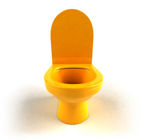 The problem we need to solve is how to conceal the complexity of a product’s structure until our audience gets past their initial fear, while making that complexity available to those who need it and are ready to deal with it. Only a small subset of our audience really needs to understand all of the details of the plumbing, but for everyone else, the plumbing generally gets in the way. All a toilet needs in terms of a user interface is a seat and the lever or button that activates the flush function; nobody needs to see the plumbing to operate a toilet successfully. Such unobtrusive designs get out of the way and let users simply use the product. Our documentation must be no different—though please note I’m not suggesting the toilet metaphor should be extended to the quality of the documentation.
Documentation must, by definition, be readable. For printed material, this means learning the basic principles of typography and applying them skillfully. (See the References section for three articles that cover the basics.) Typography must get out of the way and let the words communicate. The same rules apply for online information, but with the additional criterion that we should only hardwire the typeface choice and font size when absolutely necessary (e.g., in a diagram); for all other purposes, we must give our audience the option to choose their own typeface and size, particularly given the growing importance of tablet computers and smartphones. The phrase “fluid design” is often used to refer to layouts that reflow automatically to accommodate the size and other constraints of the display device. This is why PDF is rarely a good choice for documentation, though a surprising amount of documentation is delivered in this format. ePub and HTML are almost always better format choices because they give readers maximum freedom in deciding how to display information.
From a plumbing perspective, unobtrusive means that we must find ways to make the structure of a document clear—but only as clear as the audience needs it to be at any given point in using the product. Some solutions include expanding and collapsing menu hierarchies, home pages, bookmark lists, and tables of contents. In my experience, these tools aren’t used nearly as often as they should be, and when they are used, they’re often too obtrusive, overwhelming the product’s users instead of helping them grasp the structure. In that sense, they’re not useful.
Useful
 Our audience purchases the products we’re documenting to accomplish a purpose. They do not purchase our products simply to use the functions of those products, with the limited exception of products like games, where using the interface is a large part of the goal. Unless the user wants to show off their wealth or good taste or brainpower, they buy a product primarily to accomplish some goal. That goal can certainly include the user experience, as in the example of buying a motorcycle or sports car to better experience “the thrill of the open road”. But for most users, the experience is only the means to a larger end, and although the journey should be as smooth and pleasant as possible, a few rough edges will be tolerated if the product gets them efficiently to their goal. A product is “useful” if it gets them to that goal, and its documentation is useful only when it teaches them how the product will get them to their goal.
It’s worth noting that “efficiency” is not one of the original ten Rams design principles, though it’s implicitly part of several criteria (e.g., understandable, unobtrusive, useful) that together add up to an efficient design. As technical communicators, our goal is to make that efficiency explicit, and this is where our expertise with a product cannot be replaced. Through repeated encounters with the product as we learn how it works, we gradually discover the most efficient ways to use it, and in so doing, we learn to describe those ways so others can benefit from our experience. If we can’t uncover any efficient ways to use a product, then we can at least seek a path that makes the unusable product more palatable and can provide clear guidance both on what to do and on what not to do. Think of this as providing both a clear path along the cliff and a fence that stops our audience from stepping off the path and over the cliff’s edge.
On a related note, we rarely have the power to tell a product’s designers to eliminate a feature because it’s all flash and no substance, or because it’s a marketing checklist item that nobody will ever use. That doesn’t mean that we shouldn’t be a user’s advocate and look for ways to bring the substance to the foreground and move the flash out of the way. And speaking of flash…
Innovative
 Technology advances relentlessly, and that can be stressful both to its users and to those of us who must stay current with the latest technology. The advantage of this unending progress is the possibility of innovation: each new technology offers a new way to do something, and sometimes a better way. We must therefore keep an eye on technology and learn enough about it that we can determine when it offers better ways to communicate. We must also learn when something new is inappropriate so that we avoid using a new technology just because we can. Communication possibilities that have changed radically within the two decades of my working life include several things younger readers of this article will take for granted:
- We can easily use the most efficient visual medium, whether static visuals (text, images) or dynamic visuals (movies, animations, 3D rotations). Auditory media (e.g., podcasts) are becoming common. Yet we don’t use images other than screenshots nearly often enough, and we rarely combine them efficiently with text or audible narration. (See my article on integrating text with graphics, in the References section.) It won’t be long before tactile media (haptics) become significant; we already have force-feedback joysticks for video games, and virtual reality gloves that can be used to manipulate 3D images directly on the screen will soon escape the labs.
- Hypertext is the forgotten H in “HTML,” yet it’s what makes online help and the Web possible. We’re still looking for ways to efficiently connect the inconceivably large volumes of knowledge on the Web in a useful form, and most modern help systems do a barely adequate job of guiding readers among all relevant topics from their current position in the infoverse. Few systems do a good job of preventing us from getting lost as we wander, a problem that’s been discussed for decades with little result.
- Embedded help is a form of user assistance that is embedded in the interface or the task rather than presented externally in discrete documentation. This has been around as a concept for more than a decade (see the article by Deb and Eric Ray in the References section), yet we still see enormous volumes of documentation that aren’t integrated in any useful way with the task. Why are we still writing so much documentation when we could be creating embedded help?
- Social media have also been around for decades, though younger readers might not have known this. These media go back to at least the early 1980s in the form of computer “bulletin board systems” (BBS), and long before the Internet was widely available, there were distributed e-mail networks such as FidoNet that let us communicate with large virtual communities around the world. Yet we still haven’t mastered the use of even such antique technologies as e-mail in technical communication, let alone tweets, Facebook, and Instagram.
In short, many opportunities for innovation exist that would improve our communication, yet these new tools remain underused. That being said, we should never embrace innovation purely so we can claim to be innovative. Probably 90% of the Flash-based Web sites on the Web could be made an order of magnitude more usable by eliminating the Flash and replacing it with simple HTML. Worse yet, most of the sites that really do require Flash use it poorly, largely because the designers emphasize the cool visuals and pay little attention to usability. (For example, why does the autofill function of my browser, which saves me hours of typing, rarely work in a Flash form?) My favorite Alexander Pope quote provides good guidance: “Be not the first by whom the new are tried, nor yet the last to lay the old aside.” As technical communicators, we must remain alert for ways to improve communication via new technology, but must be wary about the possibility that our choice is new and cool rather than actually being better than what it replaces. In short, we must be honest with ourselves. But honesty also extends to the user.
Honest
Most of us don’t think much about ethics in our daily work, since we assume that technical communication is at worst ethically neutral and at best, ethically laudable. But anyone who works with a marketing department understands the tension between the need to persuade people to use our products and the need to be honest about their limitations. Where possible, we must find ways to work around a product’s limitations rather than remaining silent and hoping our audience doesn’t notice the problem. This is perhaps the greatest unsolved challenge we face in the workplace, and currently there are no good solutions other than to help the “marketeers” understand the negative consequences of deceiving or manipulating our audience. If they won’t buy the ethical argument, then perhaps they’ll buy the notion that one bad experience will be transmitted to every “friend” in the victim’s Facebook network.
Finding ways to expand our profession’s influence with management is a great long-term strategy, but in the short term, this relies on establishing our credibility among our colleagues throughout an organization. Building networks of relationships let us leverage that credibility to gain opportunities to persuade others to adopt better ways. My article on escaping the shadows provides some useful insights into this approach.
Environmentally Friendly
Speaking of ethics, we must remember that there are consequences to using any product. Laying out a book in InDesign seems fairly ethically neutral, but what could we do to help book designers use space more efficiently, thereby leading to shorter books that kill fewer trees and generate less CO2 during the production of paper, shipping of the book, and eventual recycling of the book?
 With the concept of limits to growth becoming increasingly difficult to ignore, finding ways to protect our environment should be a consideration in how we work. Accomplishing this is not trivial, and while we may have little power to revise a product’s design for lower ecological impact, we can at least look for ways to minimize that impact. For example, we can move more of our documentation from paper to online forms using more effective techniques than not providing printed manuals with a product. Have you ever noticed the number of printouts of help files littering most offices? These exist because online help is rarely designed so well that it eliminates the need to print copies of topics, particularly when the help isn’t well integrated with the product. If you have to waste ten minutes searching for an explanation of how to accomplish a task each time you need to do that task, it makes perfect sense to print a copy of the procedure and tape it to the cubicle wall.
Perhaps the best solution is to transform as much of our documentation as possible from online help into embedded help. Please note that this is not a criticism of technical writers; the technology used to develop and present online help is still primitive compared with what it will eventually become, and many employers don’t give us any easy way to hook our documentation directly into the product’s interface. Where we can’t embed help, then we must make heroic efforts to ensure that the help is context-sensitive. Too much of the software I use daily still opens a generic home page when I open the online help, instead of paying attention to what I’ve been doing or what dialog box is currently open and providing only help related to those functions.
The larger goal of being environmentally friendly is to provide specific examples of considering the adverse consequences of using the products we develop. Those consequences take obvious forms such as repetitive stress injuries and less-obvious forms such as finding ways to encourage users of the technology we document to communicate better, not faster or more flashily or less responsibly.
Esthetic
Esthetics is associated with slippery concepts such as “beauty” and “elegance”. Products such as food that has good “mouth feel” and iPods that fit into your hand like they were meant to be there are elegant, albeit in profoundly different ways. In most of the ways we’ve been taught to communicate, we’ve been indoctrinated to believe that humans are exclusively logical beings, and that there’s no place for emotions in technical communication. The neglect of emotion-related factors, such as esthetics, by designers who focus exclusively on functionality can be seen in their pejorative use of the phrase “font fondlers”, which I first encountered in the techwr-l discussion group. The basic notion is that anyone who bothers to use more than just Times New Roman and Verdana is wasting time better spent on developing more effective documentation.
 Though there’s wisdom to not obsessing over font choices, we must remember that our audience wants products that appeal to their emotions. Documentation must first and foremost be correct, comprehensive, and clear, so elegance is a secondary priority. That doesn’t mean it should be forgotten. Taste and preferences are highly subjective and vary widely within and between audiences, making it impossible to choose a design that will satisfy everyone. But we can study subjects such as typography until we learn why traditional choices work well, and find ways to build those effective and esthetic aspects of design into our documentation from the start. Many standard principles of typography contribute to ease of reading, and they’re not hard to master. We can do this easily when creating templates or design guides that can be applied automatically to our text. In strictly online channels, we should (to the extent that this is possible) allow readers to choose their own designs. In our rush to create complex and trendy CSS style sheets, we often forget that our concept of beauty may appear insufferably ugly or even completely unreadable if our reader is visually impaired. Creating effective designs and supporting them with stylesheets is a great first step, but a truly elegant design lets the viewer adapt the design to their own esthetic and functional preferences.
Online afficionados forget that books are still being printed in their millions and that people pay attention to typographic design, even if only subconsciously. Recently, I decided not to buy several interesting books because the font choice was so poor I found the pages unreadable. I’m sure I’m not alone; I subsequently found these books remaindered, and as the weeks went by, their prices declined until the bookstore was just about paying people to cart them away. An esthetic, elegant page must be easy to read, whether in print or online. Endlessly and fruitlessly debating the relative merits of Times, Baskerville, and Palatino ignores the more important point: good typography confers beauty and elegance that makes a product attractive and desirable to use. And this brings us right back to the starting point for this article, namely that good design must be functional as well as attractive.
Long-lasting
 Effective designs result from combining the nine previously discussed principles with a clear knowledge of how and why to apply the principles and a wary eye towards their limitations and potential misapplication. These designs may not be “fashionable” because they eschew current design fads, but because they are effective, they become effectively timeless. Good design stands the test of time, as in my example of imperative headings followed by relevant details: it’s a boringly conventional way to write, but we keep using it because it works so well and is not unattractive. Conceptual and technological breakthroughs will undoubtedly lead to better ways to communicate, but unless something new or trendy provides tangible improvements in the effectiveness of out communication, we have little reason to depart from the proven old ways.
There’s another reason why these design principles produce long-lasting designs: they focus on the essentials. Products evolve over time, but the core features change slowly. When we focus on the features most important to our audience, we produce documentation that remains useful for years, and possibly even for decades, with only minor modifications. Specific details of how a product implements certain features will evolve, but understanding how our audience uses those features lets us make it easier for them to use those features. Possibly even easy enough that the intimidation factor fades and they gradually become comfortable enough with a product to begin exploring on their own.
Ten Design Principles Lead to Useable and Beautiful
The best designs, whether of hardware, software, or documentation—or products that combine all three—follow each of these ten design principles to some degree. Those who depart successfully from these principles do so because they have uncovered a principle’s limitations in a specific context, and recognize a better way to communicate. Some graphic designers continue to resent the need to account for the users of their designs, and demonize functionalism as an anti-esthetic philosophy, but nothing could be farther from the truth. As so many of Apple’s products demonstrate, something useable can be beautiful, and vice versa.
References
- Carroll, J.M. (ed.) 1998. Minimalism beyond the Nurnberg funnel. MIT Press, Boston. 428 pages.
- Carroll, J.M.; van der Meij, H. 1996. Ten misconceptions about minimalism. IEEE Transactions in Professional Communication 39(2):72–86.
- Hart, G.J. 2000. Ten technical communication myths. Technical Communication 47(3):291–298. <http://www.geoff-hart.com/articles/2000/tenmyths.htm>
- Hart, G. 2007. Should we stick to the shadows, or take on a little more heat? Indus, the newsletter of STC’s India Chapter, Vol. IX No. 2, April–May 2007. <http://www.geoff-hart.com/articles/2007/shadows.htm>
- Hart, G. 2008. Typography 101A: the role of white space in making lines of text readable. Intercom July/August 2008:30–31. <http://www.geoff-hart.com/articles/2008/typography-101A.htm>
- Hart, G. 2008. Typography 101B: the role of white space in making words readable. Intercom December 2008:29–30. <http://www.geoff-hart.com/articles/2008/typography-101B.htm>
- Hart, G. 2009. Typography 101C: the role of typeface choice in making text readable. Intercom February 2009: 48–49. <http://www.geoff-hart.com/articles/2009/typography-101c.htm>
- Hart, G. 2010. Integrating text with graphics in procedures. Intercom December 2010:17–19. <http://www.geoff-hart.com/articles/2010/integrating.html>
- Norman, D. 2002. The design of everyday things. Basic Books, New York. 257 p.
- Ray, D.S.; Ray, E.J. 2001. Embedded help: background and applications for technical communicators. Technical Communication 48(1): 105-115.
- Wikipedia. 2012. Functionalism (architecture). <http://en.wikipedia.org/wiki/Functionalism_%28architecture%29>
- Wikipedia. 2012. Dieter Rams. <http://en.wikipedia.org/wiki/Dieter_Rams>
- Wikipedia. 2012. Minimalism (technical communication). <http://en.wikipedia.org/wiki/Minimalism_%28technical_communication%29>