Introduction
I used to read Wired’s articles all the time until they went to subscription-based content. I get it. They have to make money somehow, but why not use the same intrusive ads everyone else does? Why not put premium content behind a paywall and leave only the plain vanilla out for the regular folks to read?
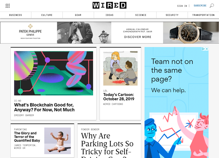
Well, they chose not to do that. Looks-wise, however, Wired still offers a clean layout with lots of white space and wide white margins. The story teasers are encapsulated in black boxes. The type is a good legible black, and the type size is reasonable too. Tabs at the top offer easy navigation. Overall, a crisp and well-defined first impression. Let’s take a closer look and see what Wired.com has to offer.
Layout and Content
I like their neatly tabbed format across the top. Unfortunately, they are not making the best use of these tabbed categories.
Homepage stories look okay, but nothing grabs me. Nothing tells me, “this is a story you will see only on Wired.” These stories could show up on any other tech site and fit right in.
Business – This section ostensibly offers stories related to business, I failed to see why these articles couldn’t have just as easily appeared on their homepage. There is no solid differentiation.
Culture – This section appeared more entertainment- and movie-oriented to me. Culture is what you experience as a part of a civilization. Culture is not, in my opinion, what you watch in movie theatres or on YouTube. What’s your opinion?
Gear – This section talks gear. Who doesn’t like gear? I especially like their Product Reviews section. I felt it strange that I had to scroll halfway down the page to find it. They review headphones, tablets, computers, televisions, and the great outdoors. That’s not all, either. Check it out for yourself.
Ideas – The ideas section seems interesting, but I couldn’t make sense of why these stories are grouped here. Again, you could swap these stories with those in the Business section or even on the homepage, with no discernible difference.
Science -The Science section I understand. Whew! I was getting worried there for a minute about my not understanding the reasons for putting stories in the previous sections. But Science has stories related to, you guessed it, science. Back on solid footing again.
Security – This section deals with the ever-present security dangers we face as well as how not to get screwed by the various members of the black hat crowd. In today’s world, where business and web entities get hacked every day, which in turn forces us to change our passwords (again), security articles seem especially pertinent.
Transportation – This section offers stories on driving and space travel, which makes sense.
The Business, Culture, and Ideas sections feel confused to me, as though the content writer was given sections into which to slot content. In an ideal world, I would eliminate these categories and concentrate on beefing up Gear, Science, Security, and Transportation.
Conclusion
Wired looks great. Love the white space and the stories delineated in black boxes. Another confusing thing for me, why would a tech site contain video advertisements for jewelry? I have heard that the ads are based on your browsing history, and other algorithms that use your personal data.
I don’t know if I buy that theory, as the jewelry I do buy online personally happens to be beads for My Better Half, because she is into beads. If the ad was for the online bead store I buy from, and proclaimed, “The Christmas Beads are here!” then I probably would have clicked on it. I would then rave about Wired’s wonderful personalization of ad content.
Because the ad was not particularly personal or helpful, I am not raving. I am simply annoyed. It was slick and well produced, I will give them that, but mostly it was distracting. Truth to tell, if they are using services such as Google Ads, they probably don’t have much control over the content that appears in ads. As with many sites today, Wired fails to keep the content in ads relevant to the content on the site.
One more thing I have learned to dislike about the contemporary web: When I finish with a page and try to exit, the page goes dark and yet another pop-up box appears, asking me to subscribe. Wired is no exception. If I wanted to subscribe, I know how to do it. These pop-ups are distracting and annoying as all get out. The box forces me to click the X or click the No Thanks button. I don’t like this design element, which seems standard across most web sites, at all.
Like The Next Web, I wanted to like Wired more than I do. If you don’t mind paying for a subscription, the content should offer techies like us more than enough to talk about in the break room at work. Sadly, Wired’s somewhat confused content strategy, coupled with a strict count-down timer of only four free article reads per month, detracts from the promise Wired offers at first glance.