
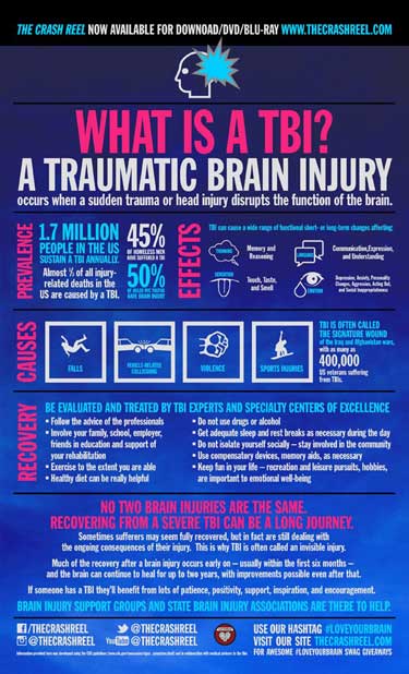
Nearly three million people in the United States alone suffer traumatic brain injuries each year. That means a significant percentage of your users may have varying degrees of cognitive issues that can challenge their abilities to read and comprehend content. October is National Disability Awareness Month, and that presents a great opportunity to look at how technical communicators can help users with brain injuries. The Centers for Disease Control and Prevention (CDC), defines traumatic brain injury (TBI) as a “disruption in the normal function of the brain,” which has been caused by some kind of physical trauma such as a bump, a blow, a jolt, or even something that stabs into the head. This infographic from Brainline.org defines TBI, explains some of the effects of TBI, and is designed using reverse type, a design style that causes readability problems for many people, including those with TBI.
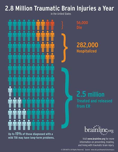
A mild TBI (mTBI) is also called a “concussion.” Doctors call these TBIs “mild” because they don’t threaten to kill us. However, the effects of even mild TBIs can follow us for long periods of time. This 2018 infographic from Brainline.org shows that up to 15% of those with mTBI may have long-term problems.
A mild TBI (mTBI) is also called a “concussion.” Doctors call these TBIs “mild” because they don’t threaten to kill us. However, the effects of even mild TBIs can follow us for long periods of time. This 2018 infographic from Brainline.org shows that up to 15% of those with mTBI may have long-term problems.
Why should technical writers think about TBIs?
Those who have suffered TBIs may try to use the content that we create. However, their injuries can cause problems with reading comprehension, memory, and reasoning. The way we write and design our content affects readability, so we can do a few simple things that will help everyone, including those who have suffered a TBI, to use our content.
To get at the nature of one person’s experience with TBI and how it affects the way she sees informational content, I spoke with one of my former students, Sue Hannah, who has sustained a traumatic brain injury in the past.
Disclaimer: not all brain injuries are alike, and some people who have brain injury may experience written and other content in a different way from my student.
Sue’s injury makes it difficult for her to process information. Nevertheless, she needs technical documents in her life: she reads instructional manuals, she shops online, and she visits websites for information she needs to participate in society such as to pay taxes and to drive a car.
Because of her injury, however, she gets frustrated by some of the documentation she needs to use.
Sue recommends the following seven actions, that we technical and professional writers can take to help her and others like her who have sustained traumatic brain injuries.
1. Exaggerate clarity.
Make information clear, not just in the words you choose but also in where you put information and what you put around that information. Is it hidden, swamped by images or other words rather than with lots of calm white space around it? Sue likes a lot of empty areas (white space) in content.
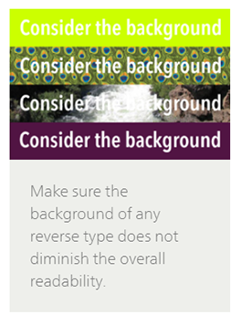
2. Avoid reverse type. Use dark-on-light, not light-on-dark.
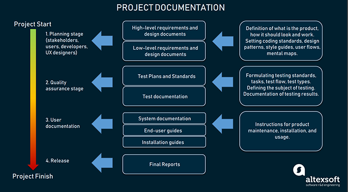
Reverse type is “light text on a dark background” rather than the “dark text on a light background.” For example, here is an infographic on the altexsoft.com website, which uses reverse type: light blue or white type on a dark blue background.
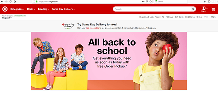
While this may be a visually pleasing design to many, Sue and many others (including me) have more difficulty processing the content—in fact she describes reverse type as a “nightmare.” She recommends avoiding reverse type except in things like logos or very short content. For example, see the Target.com use of reverse type in their bullseye, cart, and login logos and in their tab names (Categories, Deals, Trending) at the top of the page. Their other text is dark-on-light, either black-on-grey or black-on-pink. (Thanks to Ginny Redish for this example from her excellent book, Letting Go of the Words.)
Many designers choose reverse type because they think it looks great, cool, or “pops out.” However, some people—Sue and I are two of them– find reverse type very difficult to read. Choose clarity over “cool.”
On the other hand, some people prefer reverse type and say that it helps them to read. If you aren’t sure which is more helpful for your online readers, offer them the choice to change the background color. If you create paper documents, don’t use reverse type except for small elements, such as callouts.
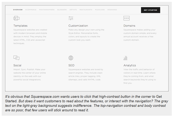
3. Avoid both low contrast and too much high contrast
Contrast is helpful to most readers. For some great examples, see Katie Sherwin’s article on the Nielsen Normal Group website. She includes samples from websites that show how low contrast creates illegible, undiscoverable, and inaccessible content:
High contrast helps not only readers, but also, according to the Model Systems Knowledge Translation Center, msktc.org, those people who are doing everyday tasks such as cutting an onion on a cutting board: MSKTC recommends using a dark cutting board when cutting light food such as white onions. https://msktc.org/tbi/factsheets/vision-problems-and-traumatic-brain-injury
MSKTC strives to get useful health information to the people who need it. See their website for resources such as Guidelines for Writing Patient Factsheets.
However, too much contrast for too much time can cause fatigue. For example, when people read text online, they can become tired if they try to read lots of high-contrast content. Carin Perron recommends that we avoid “too contrasty” content for extended text, and she provides the following examples: yellow on black and white on black on the writer2001.com website:
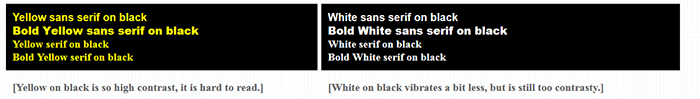
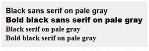
Carin suggests one way to provide less contrast between text and background is to use a light gray (at least 5% gray) or a light green background instead of bright white background. The following sample shows black type on pale gray for some, but not too much contrast.
To learn more about color contrast, see this article from WebAIM, which provides web accessibility evaluation, training, and consulting services.
4. Get rid of clutter
Sue recommends that we create webpages with minimal content. That is, when creating content for people with TBI or other cognitive issues, don’t try to pack too much information onto one page.
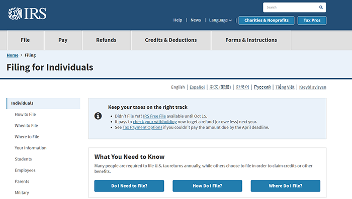
Notice, for example, how the IRS (Internal Revenue Service) succeeds in providing a good user experience with its minimal use of reverse type, a mixture of high contrast and medium contrast (light gray and light blue backgrounds), and a minimum of clutter or visual “noise”.
The Arizona Department of Transportation website, however, is too cluttered. In addition, Sue notes that it has too much reverse type, and has scrolling images with no way for us to stop them from moving. Notice especially all the images in the left menu and the number of words in the ADOT News section.

5. Make it calm: eliminate movement and sound
Movement, such as photos that change every few seconds in a “slide show” or “photo gallery” or “rotating banners” or “home page carousels” and animations, cause Sue (and me) to want to click away from a site as fast as possible. For people with TBI history, any kind of movement is more than just distracting. Movement can keep us from getting tasks done. Unfortunately, image sliders are fashionable, so many websites are using them to present more images than they can with a single stationary image.
For example, the United.com website contains an image slider. The image changes slowly, about every 5 seconds, which meets the Baymard Institute’s 5-to-7-second image-change rule for impatient web users. However, for many people, even that much movement is too much.

Groups such as GetElastic.com (see Home page usability: 5 simple rules for rotating banners) and Pagepipe.com (see What slider is the fastest loading?) have been “anti-animation” for a long time because moving objects distract everyone: trying to read something on a website with moving images is like trying to read printed text with a fly crawling around on the page. The fly pulls your eyes away from the text, and it makes you crazy.
6. Don’t use background images
Background images are bad for readability even for those who have not experienced a TBI. Notice in the image to the left how much more work it is to read the words that have an image behind them.
Nevertheless, not all images are entirely bad. For example, the US Postal Service does a fairly good job of making the right-hand side of their background image more transparent (see-through or pale) in an effort to help us read “See your mail on the go” without a lot of strain or frustration.

However, even that amount of transparency is not enough to eliminate readability issues entirely for Sue.
We can find more guidelines for creating content that mitigates all kinds of accessibility issues on the W3C website W3 is the World Wide Web Consortium, an international organization that develops Web standards.
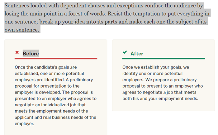
7. Avoid complex sentences
The W3 Web Content Accessibility Guidelines and the Plain Language guidelines https://www.plainlanguage.gov/ provide really useful information on how we tech writers can avoid creating barriers for people with many different types of disabilities. Note that most of the W3 guidelines refer to design issues, but the the second example below is a writing issue: avoid complex sentences that are difficult to read and understand:
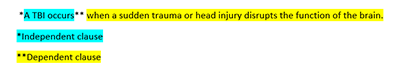
In grammar classes we learned that a simple sentence contains a subject and a verb:
A TBI occurs.
We also learned that a complex sentence contains a subject and a verb (an independent clause), and one or more dependent clauses. That is, when we add a dependent clause to an independent clause, we create a syntactically complex sentence.
W3 does not propose that we give up syntactically complex sentences altogether. We can still write dependent clauses. But a syntactically complex sentence may also be semantically complex (difficult to understand). Thus, dependent clauses can signal us to clarify our meaning.
Passive voice can also be a signal that our writing might be approaching “hard-to-understand.” If our sentences look long and confusing, they might be long and confusing.
Both the Plain Language and W3 guidelines remind us to create easy-to-comprehend sentences. The Plain Language guidelines give a good explanation of what complexity looks like and how to simplify complex writing:
In order to reduce our complexity, Plain Language guidelines tell us that we “may need to be especially inventive.” Bring it on! Language re-invention is what technical writers do best: our jobs require great creativity and ingenuity when striving to make content accessible to all of our audiences.