Introduction
The Next Web is certainly a good looking site, but even after several visits, I’m not sure what it is supposed to be about. I’m not saying I couldn’t figure it out, but taking the perspective of a first-time visitor, I was looking for a subhead to explain things.
I have been here before and I know they are trying to be Web 2.0 or 3.0 without tying themselves down to a certain version number. The Next Web tries to present to the world their concept of how the next iteration of the web should look. Let’s see what’s going on.
Layout and Content
The page is laid out on a clean white background. First up–one large headline in white superimposed on top of a darker, larger image. To the right of the first headline and image you see two smaller headlines and images. I find this an attractive and inviting layout.
Below the introductory headlines, the Latest News section appears. This mixes in legitimate news stories with ads, which are items from their deals section. Why they have to muddy their clean news with ads is beyond me. It feels like click bait to me and frankly, I don’t like it.
Aside from my gripes with how they place their deals/ads, items in the Latest News are nicely laid out, with images followed by dark, easy-to ready text. Under that, lighter text features such information as the author’s name, and hours since posting. The ads are marked with TNW Deals in lighter type, but I’m not sure that’s sufficient.
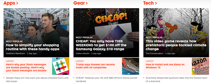
Beneath Latest News, you see sections for Latest Funding Rounds, Apps, Gear, Tech, Creative, Podium, Insights, Launch, Distract, and Latest Deals.
Apps, Gear, and Tech certainly offer enough eye candy for the nerds and techies. I urge you to investigate these for yourself. I am concentrating on the sections that seems more uncommon to me. I am talking about Creative, Podium, Insights, Launch, and Distract.
Creative – This section comprises stories on memes, design processes, games, and so forth, as well as profiles of their creators. A subhead saying “Games, Memes, and more” would help a great deal. I appreciate TNW’s desire to be staccato in this section with one-word labels, but they’re not ringing my chimes here.
Podium – This section offers opinion, advice, and other “soapboxy” topics. Matter of fact, I believe “Soapbox” might be a better label that “Podium.” I found the label “Podium” confusing. I would suggest this for a subhead: “On the Soapbox.”
Insights – I’m not sure how these stores differ from anything else TNW offers. The lack of a subhead doesn’t help, either.
Launch – This section delivers stories on new items, tests, and rollouts being announced by different companies. Again, the lack of a subhead isn’t winning me over, as I needed to spend a few seconds figuring things out.
Distract – This section offers stories on gaming and other entertainment. No subhead. Sigh. My question here is, why have gaming stores here at all? Why not place them in the Creative section? I would suggest placing all this under Creative. Again, I find this confusing.
Conclusion
TNW is a clean, easy-to-read site for techie news. I wanted to like it more than I do. It is SO nicely laid out, but suffers from a lack of a coherent content strategy to drive the user experience. I wish they kept their deals items in the Deal section and refrained from mixing them into their News section, which makes it too click-baity for me. The section headings need help, they could use subheads, and the content could be better categorized, but the Next Web is still worth visiting and bookmarking.
Have a job-related, business, or tech comm website you’d like me to review? Have some tips or tools to share with your fellow technical communicators, information developers, and content creators? Let’s network! Drop me a note: HelpFiles@TechWhirl.com. Follow me on Twitter, connect with me on LinkedIn, or email me at craig.cardimon@gmail.com. I enjoy connecting with others in the industry.