Introduction
Founded in 1991, ZDNet has been around for 28 years as of this writing. In the brick-and-mortar world, this is not necessarily a big deal, but on the internet, 28 years is a huge achievement. ZDNet,which survived the dot com boom and bust, and internet 2.0 and 3.0, features news and analysis of tech issues and tech businesses, as well as software downloads and product reviews.
Layout and Content
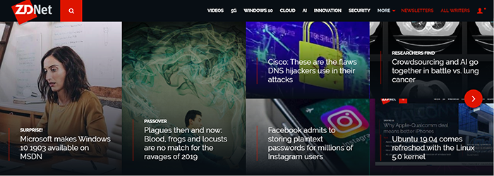
The top half of the ZDNet homepage, which loaded first in my laptop screen, is attractively laid out. Each article headline is superimposed in bright white lettering on an image related to the article. I find this high-contrast superimposition, on images that seem darker to me makes it easy to read the headlines. The articles take advantage of a “page turning” convention. To see more, click the RIGHT ARROW to turn the page.
ZDNet offers plenty of easy-to-scan and easy-to-read sections to keep geeks occupied:
- Recommended Content – Each of these sections offers an ebook listed along with a handy download button. The background is black, the printing is white, and the button is red.
- Just In – This serves as a “breaking news” section where new stories display on a white background, black typeface headlines, and — something I haven’t seen before — the number of hours since they were posted. Handy if you want to know how fresh the story is.
- Recommended For You – These sections are scattered throughout the homepage and offer ebook downloads highlighted in red, with Download Now buttons with white text on red backgrounds.
- Today on ZDNet – As if you don’t already have enough to keep busy, you can keep scrolling for even more food for thought in the Today on ZDNet section. Firing off a criticism here: There’s nothing in the UI to help me see the difference between the Just In and Today on ZDNet sections.
- More Resources – Go to a deeper level of geek with the technology white papers found here.
Bottom Menu
At the very bottom of the home page, another menu, with white text on a black background, displays. I usually ignore this section on most sites, unless I’m am looking for specific information on contacting people.
I gave this one a more thorough look, however, and discovered that, in addition to normal items such as the ZDNet social media links, you can see all the topics they regularly cover (A LOT).
I have another criticism regarding the bottom menu: The link that says All Authors, which I thought would offer mini-bios of their writers, instead goes to a page labelled Blogs or Blog Roll. I found this confusing. I had to do more digging to discover anything about the ZDNet writers. I believe they should concentrate on their writers here, and perhaps provide a differently labelled link to the blogroll.
I have some other concerns about the bottom menu. I’d suggest moving some of the bottom menu items, which are too interesting to relegate to the bottom menu where they stand a good chance of being missed, to the main menu.
I would move, for example, the Topics, Galleries, Videos and ZDNet Academy up to the top, and play around with their placement. More on the Academy in a moment. Then I discovered the main menu already has a Videos link. Perhaps they want to test effectiveness or ensure that something important is reachable even if you scroll.
Honestly, I found the top menu informative, but pedestrian. It lacks pizzazz.
ZDNet Academy
I promised you more on the Academy section. Sadly, this sparkly bit is hidden in the bottom menu, almost as an afterthought. It is the second to last item in the bottom menu. Talk about burying the lede.
ZDNet Academy should be given a more prominent spot, specifically in the main menu, particularly if they want to more effectively monetize the content. If you sign up to be notified of their latest deals, you get 10 percent off for the next 30 days. I signed up just to see what would happen. Well, nothing happened. No welcome email. Nothing. C’mon, ZDNet! I expected better from you. I waited about 10 minutes or so, and never got anything. Take that as you will.
When you arrive on the Academy page you’ll find a handy menu at the top. Hover over Courses to see the courses offered: Development, IT + Development, Photography, Design, and more. Do the same thing with your cursor for Deals and you’ll see the deals under the labels Gear & Gadgets, Apps & Software, and Designer Assets.
Accidentally or not, ZDNet did a great job of hiding this wonderful section.
Conclusion
There’s a reason ZDNet has been around for almost three decades. It is a solid, easy-to-read site, perfect for keeping up with the latest in business technology, learning about what works and what doesn’t, and going deep on topics that interest the typical geek.
Have a job-related, business, or tech comm website you’d like me to review? Have some tips or tools to share with your fellow technical communicators, information developers, and content creators? Let’s network! Drop me a note: HelpFiles@TechWhirl.com. Follow me on Twitter, connect with me on LinkedIn, or email me at craig.cardimon@gmail.com. I enjoy connecting with others in the industry.