 Data visualization involves two key concepts: big data, and summarizing results in a visual format. And both of these concepts support more effective content creation. Big data refers to the systems used to collect a great deal of unstructured information as data points. Most often, the organizations collect this data about customers and clients and it relates to their habits, preferences, and even financial impact. But companies collect other forms of data too, such as inventory and supplies, employee productivity, and a variety of other metrics deemed relevant to the business.
Companies invest a lot of resources to then make use of all the data collected. Teams of analysts not only look big data over it to understand what it means and how to categorize it, but also visualize it as the information. Are there patterns that can be found? What additional information can be extracted and processed to support business decisions?
The answer lies in a set of processes known as data visualization.
What Is Data Visualization?
Simply put, data visualization is the presentation or arrangement of data in a visual or graphical format.
Or, as Oracle puts it, the term “describes the presentation of abstract information in graphical form.”
Data is raw unprocessed facts and figures, while information is data that has been given context or meaning. Knowledge is gained from information, and we transform this information into actionable knowledge. Not all knowledge can be neatly organized into rows and columns. Knowledge can mean relationships, metadata, contexts, and even text.
Data visualization makes looking at a great deal of information easier, so that a reader can go beyond a dense wall of text or numbers to make sense of it and identify important patterns and trends–to acquire knowledge.
Primarily, data visualization allows decision-makers to glean various patterns or concepts from the collected information to make better business decisions. This process effectively allows you to change the way you view sets of data.
Here’s a simple example offered by Ryan Sleeper, a data visualization designer.
Consider these two figures:
23.4K vs. 3.42M
It’s clear that the first figure is smaller than the second figure, but it’s hard to grasp the scale of the difference. So here’s the two numbers visualized into a bar chart:

With just one glance, it’s so much easier to interpret these numbers, making it more memorable and effective. Visualizing raw data always enhances the value.
90 percent of information transmitted to the human brain is visual, and 60 percent of adults consider themselves visual learners. The brain comprehends graphical representations through charts and graphs more easily than a complex list or series of numbers. So, visual data produces better internal results with employees, and external results with customers and other stakeholders.
When marketers were asked what types of visual content had the highest engagement ratings, over 41 percent revealed that infographics and other unique graphics are the most attractive. Another 25.7% said that charts, graphs, and data visualizations performed the best. Text, when paired with graphics, equal much more than the sum of their parts.
Data analysts – also known as data scientists – sort through collected data and turn it into usable information. They identify the patterns, key data points, and important aspects of a set and then translate it to a visual, more accessible form. From there content professionals can also assist in using the graphical form to tease out patterns trends and correlations.
With mounting concerns over privacy and data security, one might look data visualization as nothing more than spying. But most customers know you’re collecting data about them, and seem okay with it as long as they’re notified.
Sometimes, brands and businesses mask data collection strategies to make customers feel more comfortable. Loyalty programs, for example, give something back to customers, while the data scientists collect a lot of useful information.
How Does Data Visualization Work?
Here’s a basic example to illustrate how data visualization works.
A retail business decides collect purchase history in their store, to see what products and services customers are spending the most money on. To correlate with this new survey, they send out a poll to customers asking them why they purchased the items they did. Collectively, this information, along with sales data on when customers purchased, returns, additional purchases, support calls, and so on, tells the business owners almost everything they want to know.
But to make sense of it all, they need to sort through the data and connect the dots. In other words, they need to track what products customers bought and when, and correlate it to the related poll data that explains why they spent their money on those items.
This processes demonstrates the concept of big data collection. It includes the facilitation and collection of this data, and then the organization and translation of it.
But just having this information available does nothing. To turn it into a usable form, analysts, designers and writers work together to create infographics, charts, or visual representations to explore in greater detail. These visualized elements become part of internal business presentations, product roadmaps, sales strategies, and customer support—the big data turns into a visual, more practical form.
Why Is Data Visualization Important?
Without visual representations, management, teams and customers cannot discern what’s going on with said information or what it means to them. It has been this way for decades – the history of data visualization dates all the way back to centuries ago. The idea of arranging data into tables were prevalent since the 2nd century, but graphically representing quantitative information didn’t emerge until the 17th century.
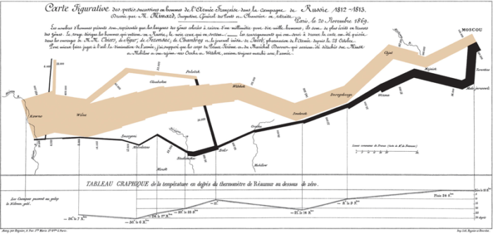
A digitized version of Charles Joseph Menard’s 1869 visualization of Napoleon’s Russian campaign. The map’s French caption reads in part: Figurative Map of the successive losses in men of the French Army in the Russian campaign 1812-1813. Drawn up by M. Minard, Inspector General of Bridges and Roads in retirement. Paris, November 20, 1869. The numbers of men present are represented by the widths of the colored zones at a rate of one millimeter for every ten-thousand men; they are further written across the zones. The red [now brown] designates the men who enter into Russia, the black those who leave it.
For example, simply collecting a list of products customers are buying produces nothing more than a basic transaction history. But analyze the data, and separate those purchases by demographic and item using databases or even spreadsheets, and then display them using charting and other graphics tools, and the company can immediately identify trends they can harness for future success.

A visual representation of that transaction history might show that a higher percentage of young adults tend to buy a lot of electronics or video games. Conversely, that data may show that more adults are buying movies in brick-and-mortar stores than younger audiences. Armed with that knowledge, the company can make decisions on what items to promote heavily, and how to move into online distribution or streaming.
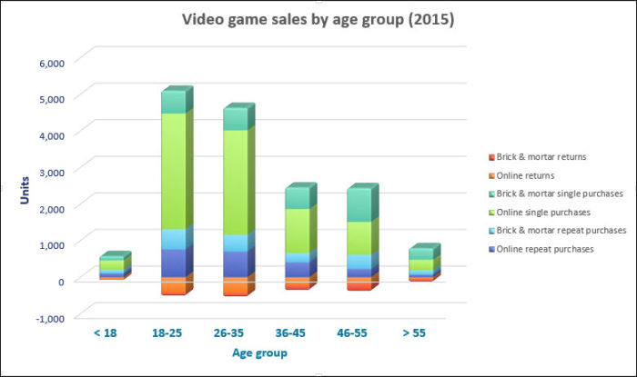
Visualizing sales data makes it easier to spot trends and patterns
Remember that information can be applied and presented in many different ways. And using visualized data for sales can work completely differently than using the same data to make customer support decisions, such as how to walk a user through a complex software function. Today’s data visualization experts produce static, animated and interactive graphics that provide unique views into the organization’s data that support decisions about policy, products and services. Data visualization becomes an effective strategy when executed to support all the organization’s objectives.
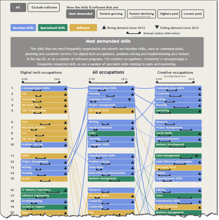
Nesta.org’s top 30 skills chart (UK), demonstrates the power of visual data to influence decision-making.
Additional Resources
- https://www.forbes.com/sites/michaelkanellos/2016/03/11/the-five-different-types-of-big-data/#1fc62e5f6f87
- https://www.oracle.com/solutions/business-analytics/data-visualization.html
- http://www.kmworld.com/Articles/Editorial/Features/Visualizing-knowledge-92017.aspx
- http://www.webmarketinggroup.co.uk/blog/why-every-seo-strategy-needs-infographics/
- https://venngage.com/blog/visual-content-marketing-statistics/
- https://www.visioncritical.com/trade-off-falacy/
- https://www.bdo.com/blogs/restaurants/april-2016/are-you-getting-the-most-out-of-your-data
- https://www.interaction-design.org/literature/book/the-encyclopedia-of-human-computer-interaction-2nd-ed/data-visualization-for-human-perception
- https://www.ryansleeper.com/a-spreadsheet-is-not-a-data-visualization/